What is Vega-Lite?
Vega-Lite is an open source language to store and exchange descriptions of visualisations. These descriptions are called specifications. Vega-Lite uses the JavaScript Object Notation (JSON) for its specifications.
Vega-Lite was designed as a more concise and convenient version of the even more flexible but harder to work with Vega language. Both Vega and Vega-Lite can be used to specify the interactive behaviour of a visualisation too. Vega and Vega-Lite were developed at the Interactive Data Lab of the University of Washington.
Vega-Lite is not a library or a software program that you can use on its own to produce data visualisations. Vega-Lite specifications only describe how a visualisation should be constructed from the data, based on the logic and the building blocks of the Grammar of Graphics.
Under the hood, many visualisation tools are using Vega and Vega-Lite, and many programming languages have plugins to work with Vega-Lite specifications and generate visualisations based on them. Check the Vega-Lite Ecosystem for an overview of tools and plugins that use Vega-Lite.
Getting started with Vega-Lite
The documentation of the full Vega-Lite specification is published at vega.github.io/vega-lite/docs. In this module, we will link back to parts of this documentation for reference.
The main tool to edit Vega-Lite specifications and generate visualisations based on them is the online Vega-Lite editor. To use the editor, no software needs to be installed on your computer: everything runs in the browser.
In the Vega-Lite editor, you can view and edit the Vega-Lite JSON specification in the left pane, and the resulting visualisation is shown on the right. This means that on top of Vega-Lite, the Vega-Lite editor is using an additional library to generate the chart from the Vega-Lite specification.
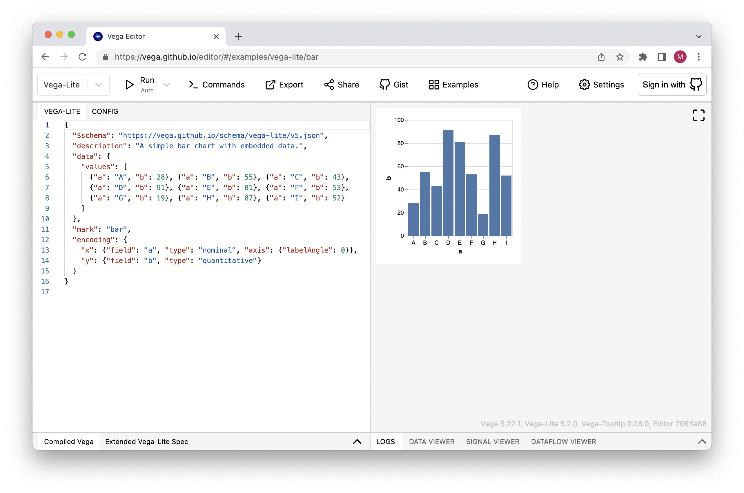
Source: Maarten Lambrechts, CC BY SA 4.0
With the “Export” button in the top menu, you can export the visualisation or the specification in various formats, and with the “Examples” button you have access to the almost 200 visualisations and their specifications in the Vega-Lite examples gallery.
Introduction to JSON
Because Vega-Lite specifications are written in JSON, a basic understanding of JSON is needed before starting to work with Vega-Lite.
JSON, or Javascript Object Notation, is a human readable, open standard file format that is widely used to exchange data. Although its name indicates that it originated from the JavaScript programming language, it is used by many other programming languages, and many tools are able to read and write JSON files (which can (but don’t have to) have a .json file extension).
JSON files can be opened and edited with any text editor, and its structure consists of key-value pairs separated with a colon:
{
  "firstName": "John",
  "lastName": "Smith",
  "isAlive": true,
  "age": 27,
  "address": {
    "streetAddress": "21 2nd Street",
    "city": "New York",
    "state": "NY",
    "postalCode": "10021-3100"
  },
  "phoneNumbers": [
    {
      "type": "home",
      "number": "212 555-1234"
    },
    {
      "type": "office",
      "number": "646 555-4567"
    }
  ],
  "children": [],
  "spouse": null
}
From the example JSON above, you can see that the values can be
- a string, see for example the value of
firstName - a number, see the value of
age - an object with child properties. These child properties are enclosed in curly brackets
{ }, see for example the value ofaddress - a list of values or objects. These lists are called arrays and they are enclosed in square brackets
[ ], see the value ofphoneNumbersfor example (the value ofchildrenis an empty array)
To work with Vega-Lite, you will need to edit JSON manually. Because the JSON syntax is pretty sensitive to errors, you should pay attention to
- always use double quotation marks for property names and string values
- always close any opened quotation marks
- always close any opened curly or square brackets
The Vega-Lite editor can help you to avoid or spot errors. It uses different font colours to show semantic meaning (strings are blue and numbers are green, for example) and it will notify you in case of errors.
Clicking right in the editor pane and selecting “Format Document” will apply indenting and line breaks which makes the JSON you are editing more readable.
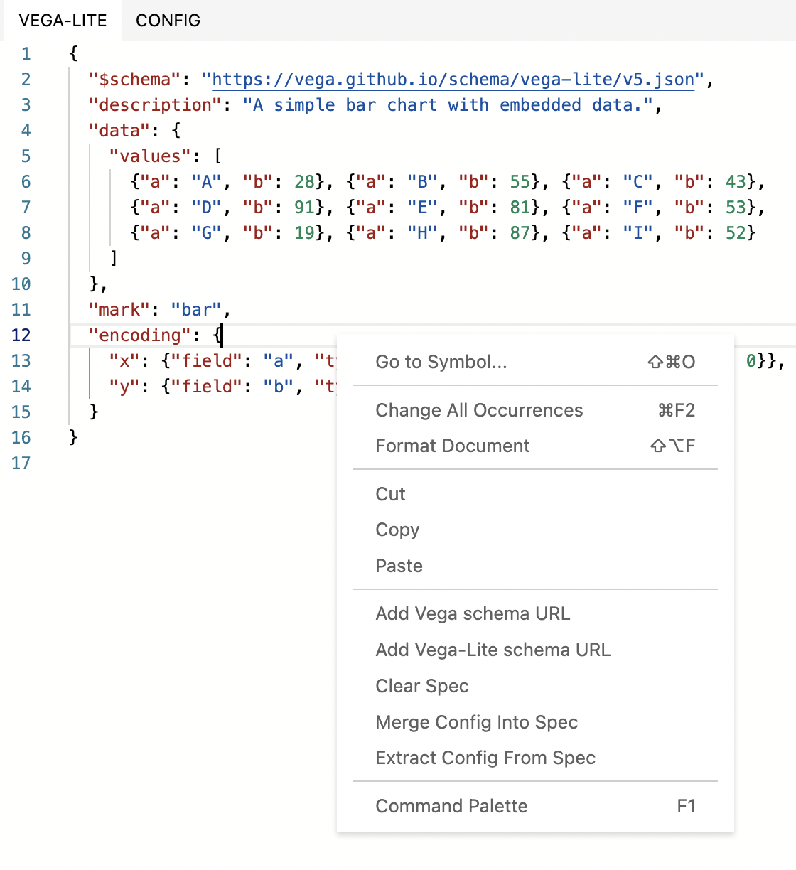
The menu that appears when clicking right in the editor pane. Source: Maarten Lambrechts, CC BY SA 4.0
Making a visualisation with Vega-Lite
In this module, we are going to create the same visualisation as in Grammar of graphics in practice: Tableau.
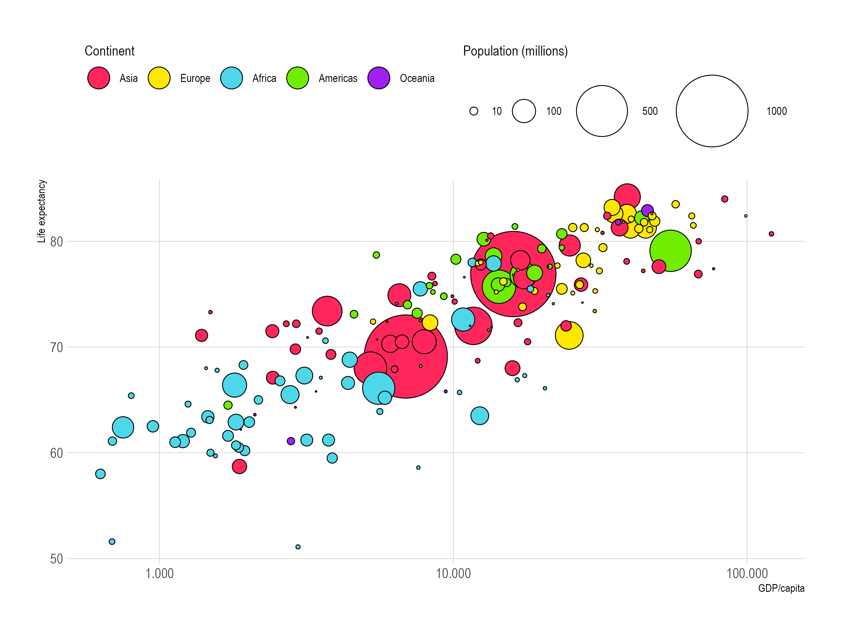
Source: Maarten Lambrechts, CC BY SA 4.0
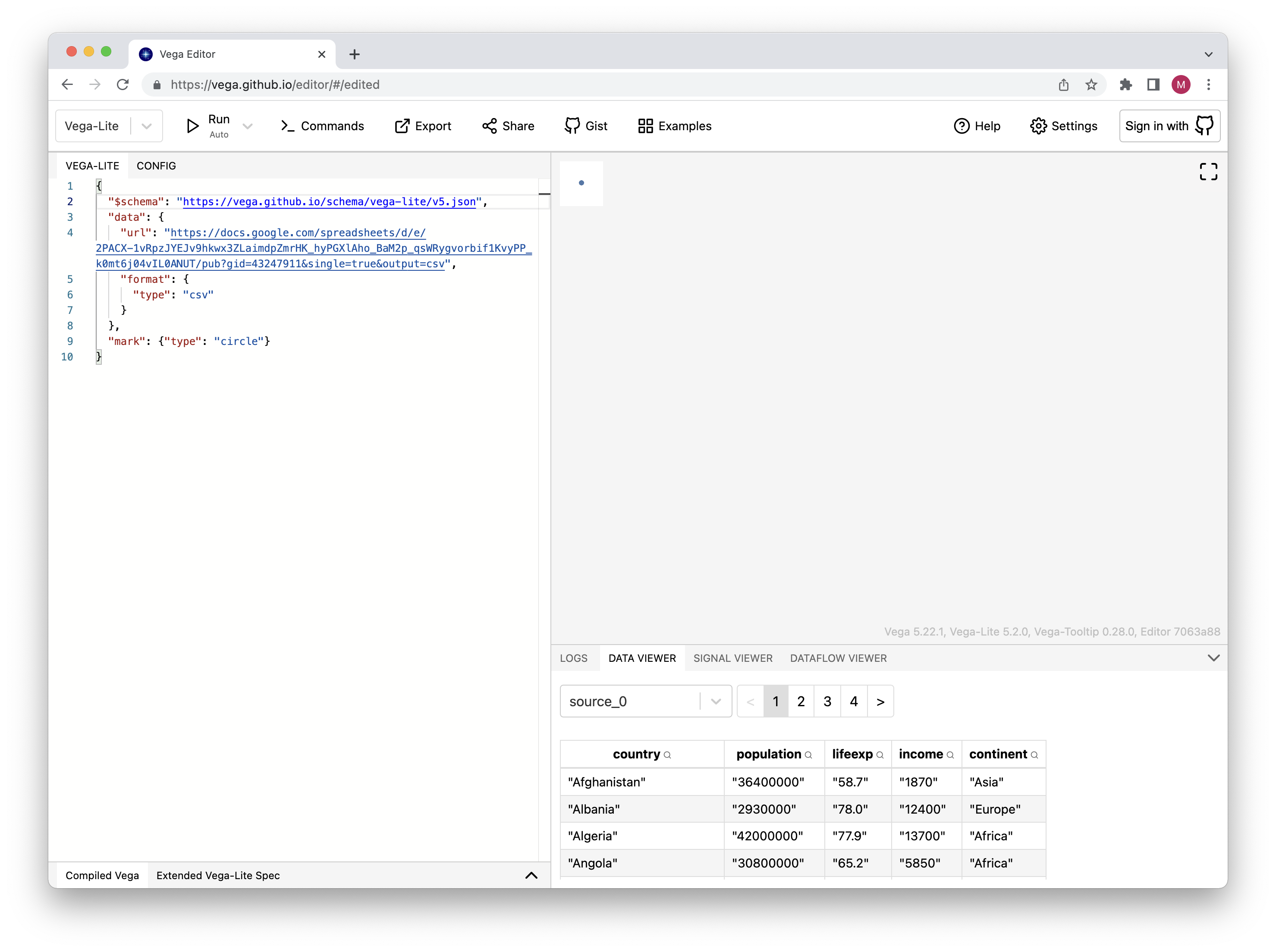
This time the data is hosted on Google Sheets, and we can use the url property of Vega-Lite’s top level data property to load data from a url.
The JSON snippet below is the “minimum viable specification” to load data in the Vega-Lite editor.
{
  "$schema": "https://vega.github.io/schema/vega-lite/v5.json",
  "data": {
    "url": "https://docs.google.com/spreadsheets/d/e/2PACX-1vRpzJYEJv9hkwx3ZLaimdpZmrHK_hyPGXlAho_BaM2p_qsWRygvorbif1KvyPP_k0mt6j04vIL0ANUT/pub?gid=43247911&single=true&output=csv",
    "format": {
      "type": "csv"
    }
  },
  "mark": {"type": "circle"}
}
You can copy/paste the above snippet in the Vega-Lite editor, and inspect the loaded data in the Data Viewer in the bottom right.
Source: Maarten Lambrechts, CC BY SA 4.0
In this snippet
- the
$schemaproperty specifies the version of Vega-Lite that is being used. In this case is this version 5. - every Vega-Lite specification needs a
dataproperty that specifies the data to use for the visualisation. In this case, the data is loaded from aurland it is in thecsvformat. - Vega-Lite specifications are invalid without a
markproperty. In the visualisation pane on the right, this mark is visible as a single, little circle (you might have to click on the “Run” button in the top left of the editor).
To visualise the data, we need to map the variables in the data to the aesthetics of geometric objects. Or, in Vega-Lite language, we need to encode fields into the properties of the marks. You can do that by adding an encoding property to the specification, and specify which field you want to encode into which property.
Start by encoding the lifeexp field to the y property of the marks:
{
  "$schema": "https://vega.github.io/schema/vega-lite/v5.json",
  "data": {
    "url": "https://docs.google.com/spreadsheets/d/e/2PACX-1vRpzJYEJv9hkwx3ZLaimdpZmrHK_hyPGXlAho_BaM2p_qsWRygvorbif1KvyPP_k0mt6j04vIL0ANUT/pub?gid=43247911&single=true&output=csv",
    "format": {
      "type": "csv"
    }
  },
  "mark": {"type": "circle"},
  "encoding": {
    "y": {
          "field": "lifeexp",
          "type": "quantitative"
        }
  }
}
The result is a first (but still rather unimpressive) visualisation:
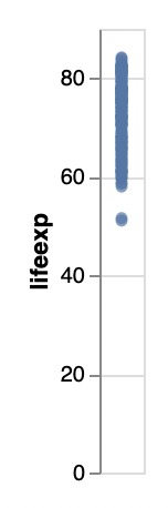
Source: Maarten Lambrechts, CC-BY-SA 4.0
Note that in the encoding for y, we need to set the type of the lifeexp field to “quantitative”. This makes sure that the numeric values in that field are correctly parsed as numbers, and the y scale is a numerical one.
Let’s add the encoding for the x property.
{
  "$schema": "https://vega.github.io/schema/vega-lite/v5.json",
  "data": {
    "url": "https://docs.google.com/spreadsheets/d/e/2PACX-1vRpzJYEJv9hkwx3ZLaimdpZmrHK_hyPGXlAho_BaM2p_qsWRygvorbif1KvyPP_k0mt6j04vIL0ANUT/pub?gid=43247911&single=true&output=csv",
    "format": {"type": "csv"}
  },
  "mark": {"type": "circle"},
  "encoding": {
    "y": {"field": "lifeexp", "type": "quantitative"},
    "x": {"field": "income", "type": "quantitative"}
  }
}
The result is a little scatter plot:
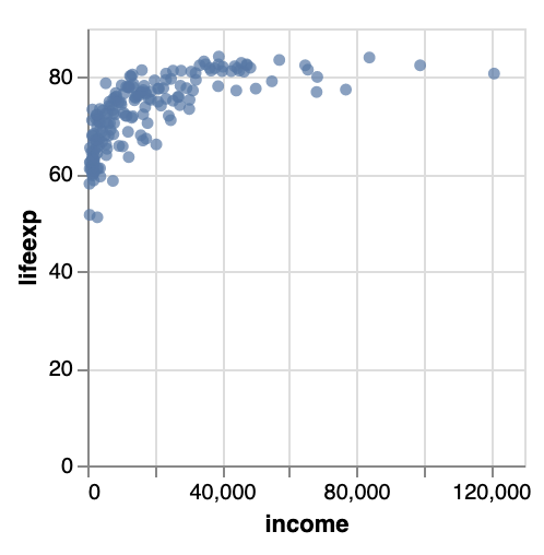
Source: Maarten Lambrechts, CC BY SA 4.0
Before we add more encodings, let’s make the plot a bit bigger by specifying a width and a height property.
{
  "$schema": "https://vega.github.io/schema/vega-lite/v5.json",
  "width": 800,
  "height": 500,
  "data": {
    "url": "https://docs.google.com/spreadsheets/d/e/2PACX-1vRpzJYEJv9hkwx3ZLaimdpZmrHK_hyPGXlAho_BaM2p_qsWRygvorbif1KvyPP_k0mt6j04vIL0ANUT/pub?gid=43247911&single=true&output=csv",
    "format": {"type": "csv"}
  },
  "mark": {"type": "circle"},
  "encoding": {
    "y": {"field": "lifeexp", "type": "quantitative"},
    "x": {"field": "income", "type": "quantitative"}
  }
}
Note that the order in which properties are added to the Vega-Lite specification does not matter. What does matter, however, is the hierarchy in the specification. For example, the url and format properties need to be specified as (direct) children of the data property.
When the expected JSON hierarchy is not respected, the Vega-Lite editor will signal an error.
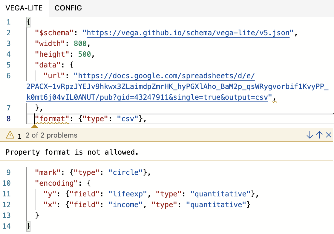
The format property should be a child of the data property, and not be a sibling of it. The Vega-Lite editor will show any errors in the editor pane. Source: Maarten Lambrechts, CC BY SA 4.0
Let’s return to the plot and add fill and size encodings.
...
"encoding": {
    "y": {"field": "lifeexp", "type": "quantitative"},
    "x": {"field": "income", "type": "quantitative"},
    "fill": {"field": "continent"},
    "size": {"field": "population", "type": "quantitative"}
  }
...
The continent field is categorical, and we don’t need to set its type to be correctly parsed. If you would still like to do so, you should set the type property to a value of “nominal”.
The chart now looks like this, with legends for the fill and size encodings added to the plot automatically:
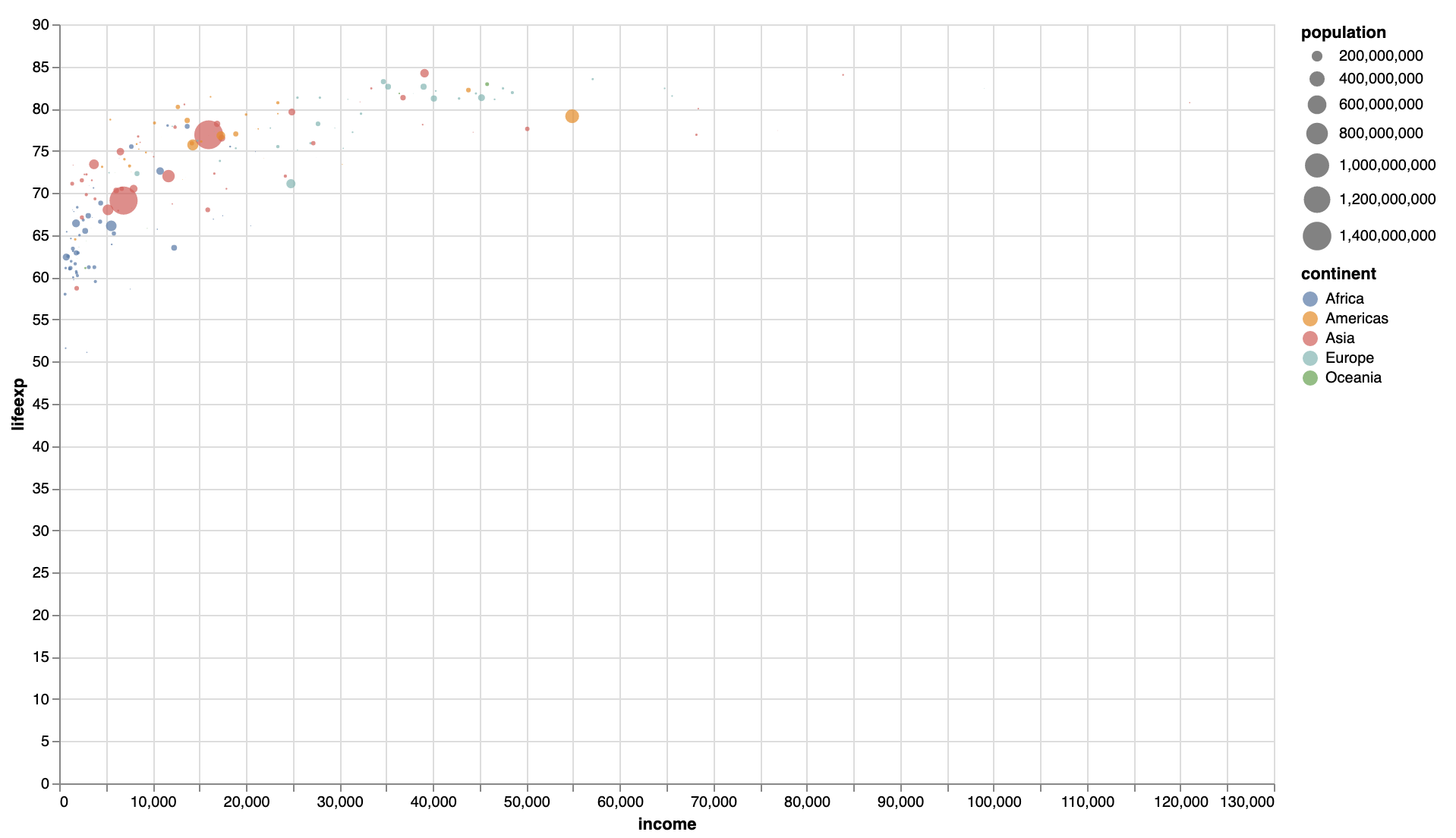
Source: Maarten Lambrechts, CC-BY-SA 4.0
Now it’s time to work on the scales and axes. Let’s turn the x scale into a logarithmic one, specify the start and end values of the axes, and limit the number of ticks.
...
"encoding": {
    "y": {
      "field": "lifeexp",
      "type": "quantitative",
      "scale": {"zero": false},
      "axis": {"tickCount": 4}
    },
    "x": {
      "field": "income",
      "type": "quantitative",
      "scale": {"type": "log", "domain": [500, 120000]},
      "axis": {"tickCount": 3}
    },
    "fill": {"field": "continent"},
    "size": {"field": "population", "type": "quantitative"}
  }
...
Setting the zero property to false on a scale relieves it from the requirement to start at zero, the start and end value of a scale can be set with the domain property. And finally, the number of ticks on an axis can be set with the tickCount property:
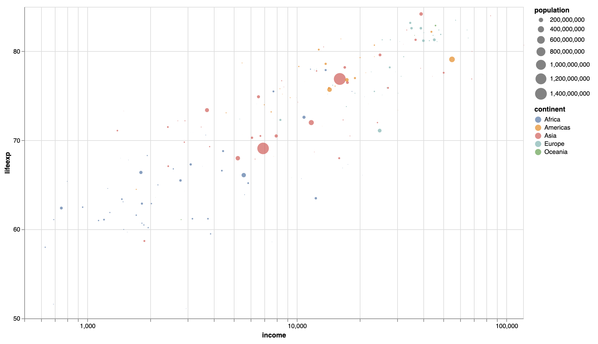
Now, let’s also configure the scales and legends for the size and fill encodings, and move the legends to the top of the plot:
...
"encoding": {
    "x": {
      "field": "income",
      "type": "quantitative",
      "scale": {"type": "log", "domain": [500, 120000]},
      "axis": {"tickCount": 3}
    },
    "y": {
      "field": "lifeexp",
      "type": "quantitative",
      "scale": {"zero": false},
      "axis": {"tickCount": 4}
    },
    "fill": {
      "field": "continent",
      "title": "Continent",
      "legend": {"orient": "top"}
    },
    "size": {
      "field": "population",
      "type": "quantitative",
      "title": "Population",
      "scale": {"range": [0, 10000]},
      "legend": {
        "values": [10000000, 100000000, 500000000, 1000000000],
        "orient": "top"
      }
    }
  }
...
Source: Maarten Lambrechts, CC-BY-SA 4.0
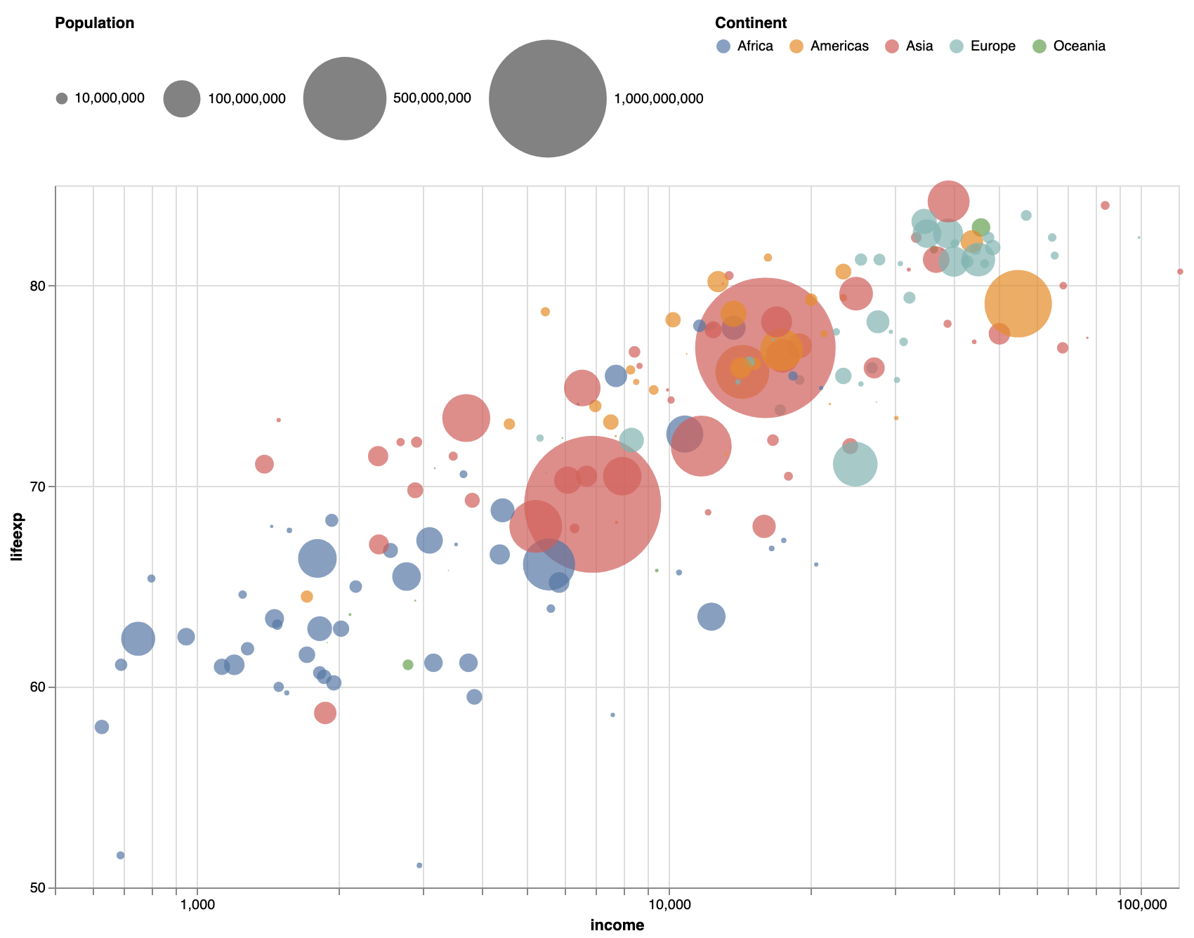
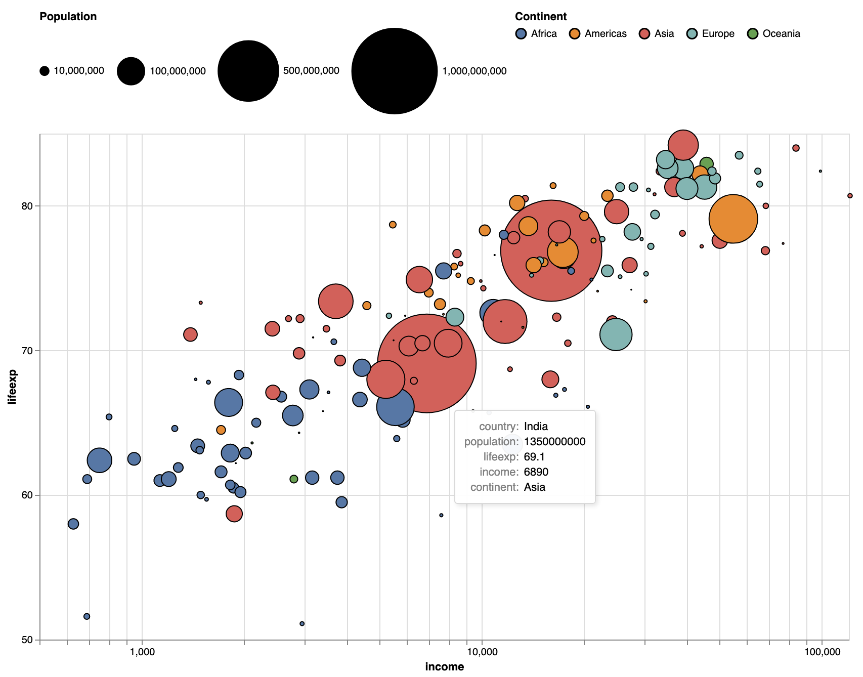
As a last step, we can configure the visual properties that don’t carry any data encoding directly in the mark property:
...
"mark": {
    "type": "circle",
    "strokeWidth": 1,
    "stroke": "black",
    "opacity": 1
    },
  "encoding": {
		...
  }
...
Source: Maarten Lambrechts, CC-BY-SA 4.0
This is pretty close to the original chart. If you would like, you could set the colours for the fill encoding by adding a scale property to it and set the colours to use in its range property.
The full specification of this plot is contained in the JSON file linked to below. You can download it, open it with any text editor, and copy/paste the specification in the Vega-Lite editor to reconstruct the same plot.
Extra
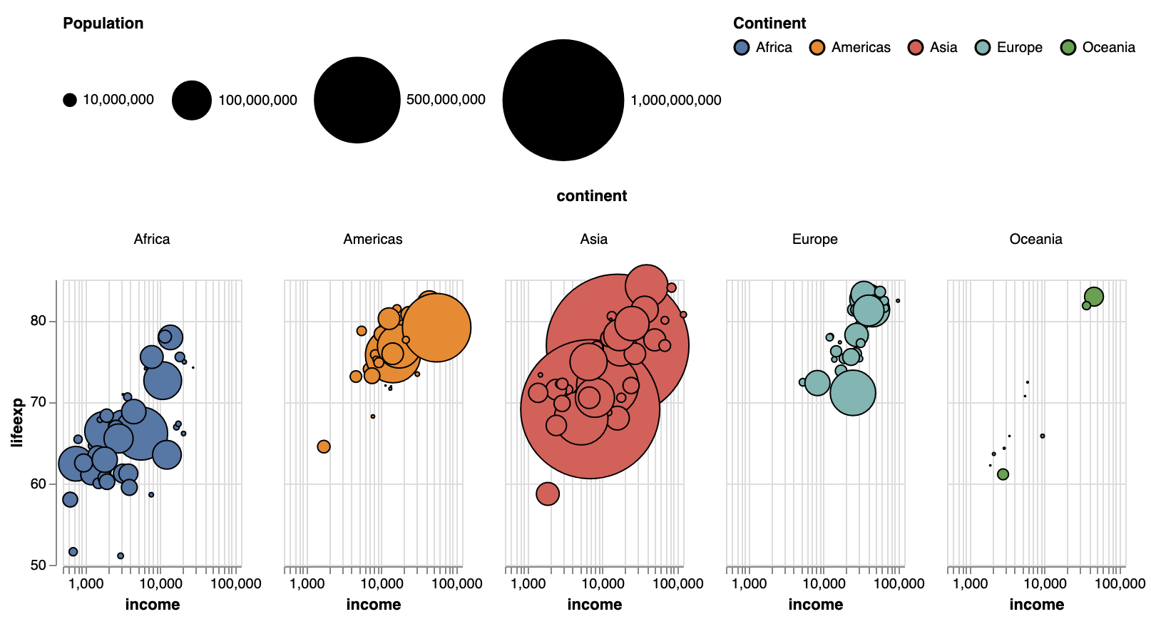
To facet the plot, the only thing you have to do is to add an additional facet encoding.
...
"encoding": {
    "facet": {"field": "continent"},
		"x": {...},
		"y": {...},
    "fill": {...},
    "size": {...}
  }
...
Source: Maarten Lambrechts, CC-BY-SA 4.0
For faceted plots, you should adjust the width and height properties, because they apply to every faceted small multiple plot.
Adding tooltips to a Vega-Lite plot can be done by setting the tooltip property in the mark specification to true (this will show the values of the fields encoded in the mark), or you can set the tooltip property to {"content": "data"} to show all fields in the data (in this case, this will also reveal the country name of each country).
...
"mark": {
    "type": "circle",
    "strokeWidth": 1,
    "stroke": "black",
    "opacity": 1,
    "tooltip": {"content": "data"}
 }
...
Source: Maarten Lambrechts, CC-BY-SA 4.0
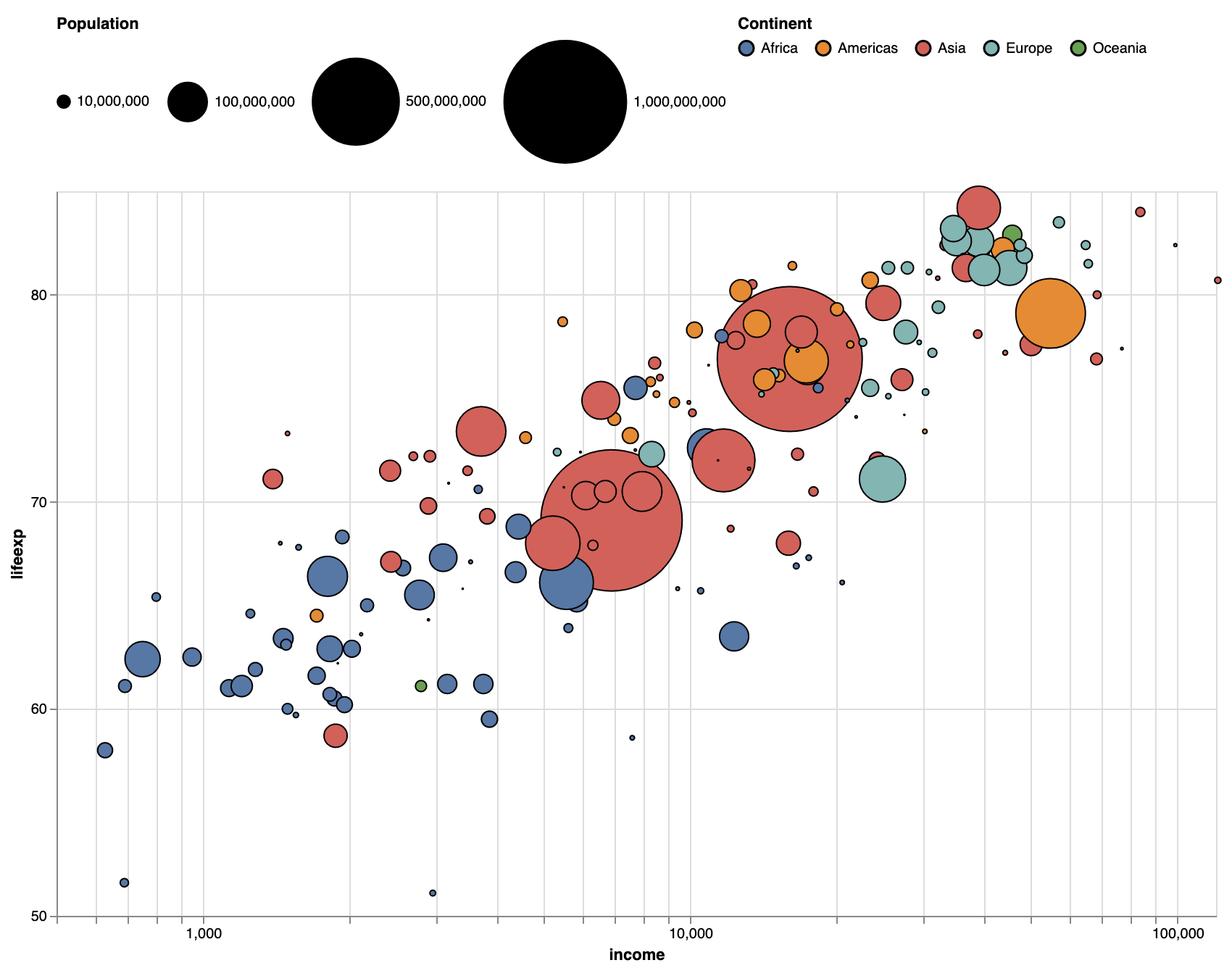
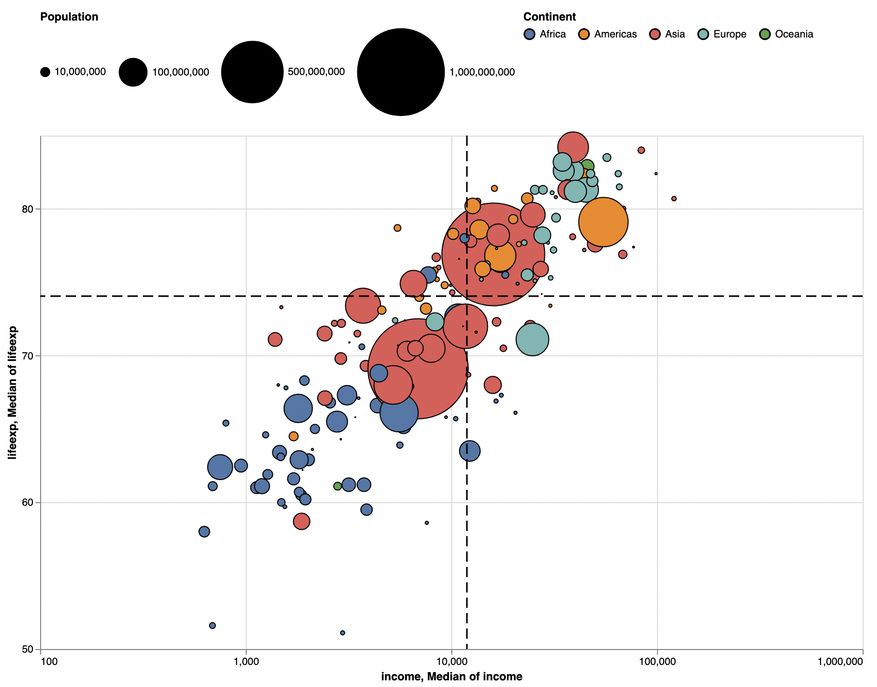
Finally, to demonstrate some of the data transformations built into Vega-Lite, and to show how layering works in Vega-Lite, we add vertical and horizontal lines to the plot to annotate the median values for life expectancy and income.
To do so, we need to add a layer property, with as value an array of marker specifications. So the structure of the specification needs to change from this…
...
"mark": {
	"type": "circle"
	...
}
"encoding": {
	...
}
...
… to this:
...
"layer": [
	{
		"mark": {
			"type": "circle"
			...
		}
		"encoding": {
			...
		}
	}
]
With this new structure we can start to add additional layers:
...
"layer": [
	/* Layer 1 specification */
	{
		"mark": {
			"type": "circle"
			...
		}
		"encoding": {
			...
		}
	},
	/* Layer 2 specification */
	{
		"mark": {
			"type": "rule"
			...
		}
		"encoding": {
			...
		}
	},
/* Layer 3 specification */
	{
		"mark": {
			"type": "rule"
			...
		}
		"encoding": {
			...
		}
	}
]
With layers 2 and 3 specified as follows…
...
"layer": [
	/* Layer 1 specification */
	{
		"mark": {
			"type": "circle"
			...
		}
		"encoding": {
			...
		}
	},
	/* Layer 2 specification */
	{
      "mark": {
        "type": "rule",
        "color": "black",
        "size": 1.5,
        "strokeDash": [10, 5]
      },
      "encoding": {
        "y": {
					"aggregate": "median",
					"field": "lifeexp",
					"type": "quantitative"}
      }
    },
    {
      "mark": {
        "type": "rule",
        "color": "black",
        "size": 1.5,
        "strokeDash": [10, 5]
      },
      "encoding": {
        "x": {
					"aggregate": "median",
					"field": "income",
					"type": "quantitative"
				}
      }
    }
]
…the plot looks like this, with dashed horizontal and vertical lines indicating the median values for life expectancy and income:
Source: Maarten Lambrechts, CC-BY-SA 4.0
The crux here is in the aggregate property: with it, you can summarise the values in a field to an aggregated value. In this case we are using “median” for the median values, but you could also set it to “average” for the average values, for example.