What is ggplot2?
ggplot2 is a package for the R programming language to make visualisations. It is based on the Grammar of Graphics: the “gg” in the package’s name stands for Grammar of Graphics.
The ggplot2 package is part of an ecosystem of R packages that share the same philosophy and approach to working with data and making visualisations. This group of packages is called the tidyverse, and tidy data is a fundamental part of these packages, see Intro to tidy data.
ggplot2 was developed by statistician Hadley Wickham, and for many R users the package has replaced the native plotting functionality built into the R language.
Getting started with ggplot2
In order to make visualisations with ggplot2, you need an environment to write and run R code. For this tutorial there are 2 options to do so.
The first option is to download and install RStudio. RStudio is an application that was developed to make working with R code easy. It is an integrated development environment (IDE), which means it does things like managing your files, viewing data tables and visualisations and detecting errors in your code.
To use RStudio, you need to install R first. You can download R from this page. Once R is installed on your computer, you can download RStudio from this page and install it too.
If you can’t or don’t want to install new programs on your computer, you can use RStudio Cloud. RStudio Cloud is an online version of RStudio which runs in your browser. To use RStudio, the only thing you have to do is to create a (free) account for it. You can create an account for RStudio on this page.
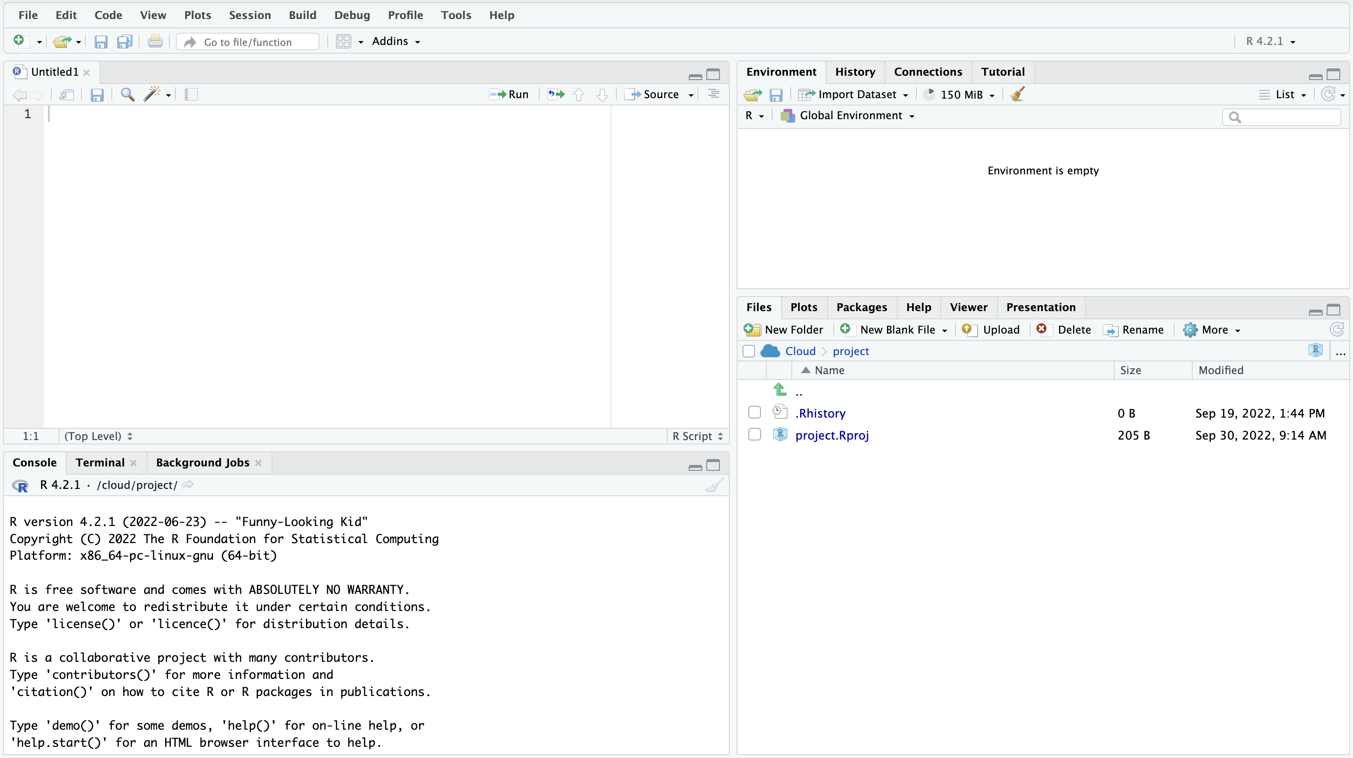
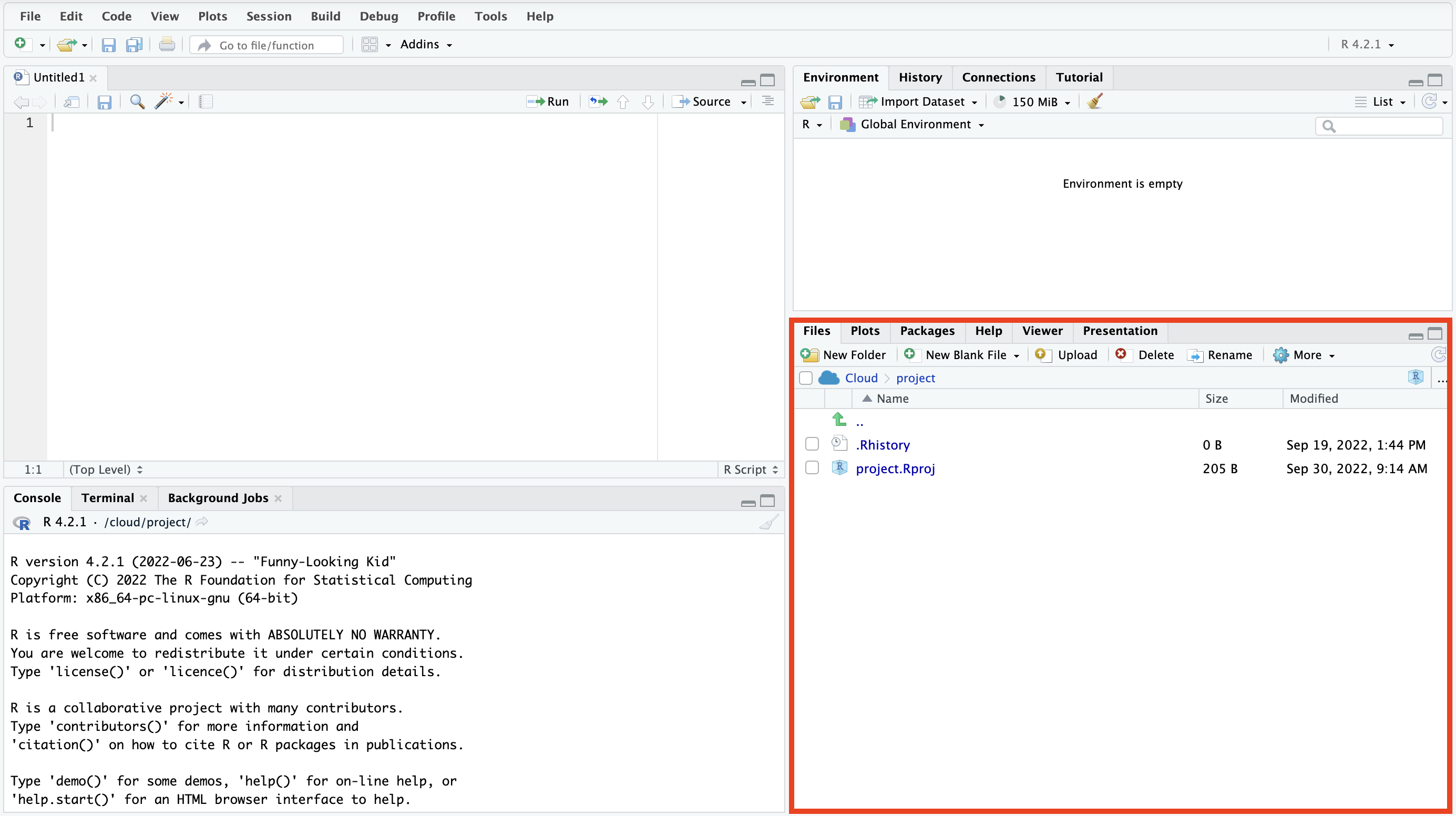
Once RStudio is installed and opened, or when you have logged into RStudio Cloud and created a first work space on it, you will see the RStudio interface.
Source: Maarten Lambrechts, CC BY SA 4.0
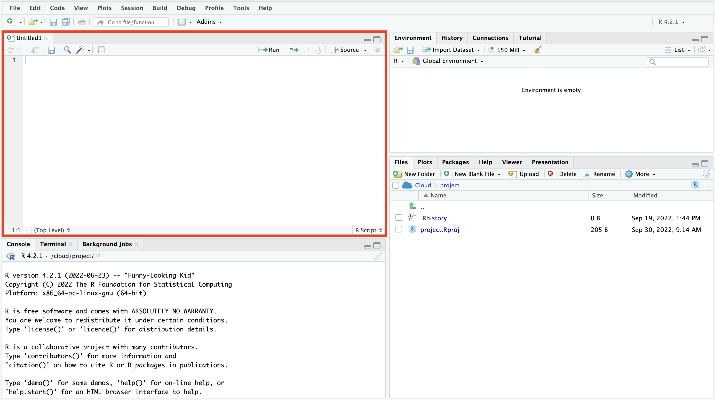
The RStudio interface is divided into 4 main panels. The panel in the top left is called the source, and this is where you write and edit R scripts.
Source: Maarten Lambrechts, CC BY SA 4.0
If the source pane is not visible initially, you can click File > New file > R script, or click the green “+” button and select “R script” to open a new empty R script in the source pane. You can have multiple R scripts open simultaneously, because the source pane uses tabs. The source pane is also used to preview data.
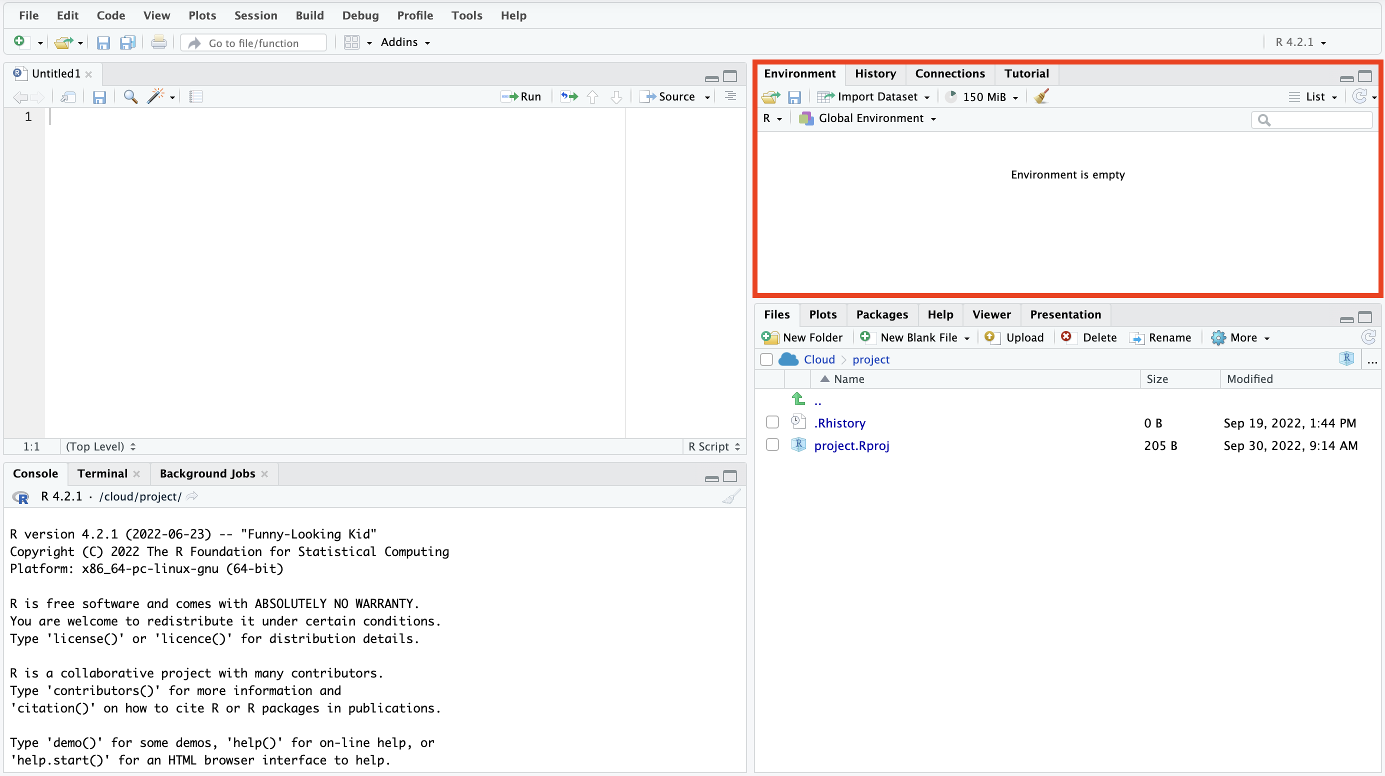
In the top right, you will find the environment pane.
Source: Maarten Lambrechts, CC BY SA 4.0
In the environment pane you will find an overview of all the objects currently loaded in your R session. It also contains a history of all the commands you have previously run, and a wizard for importing data (click “Import Dataset” for this).
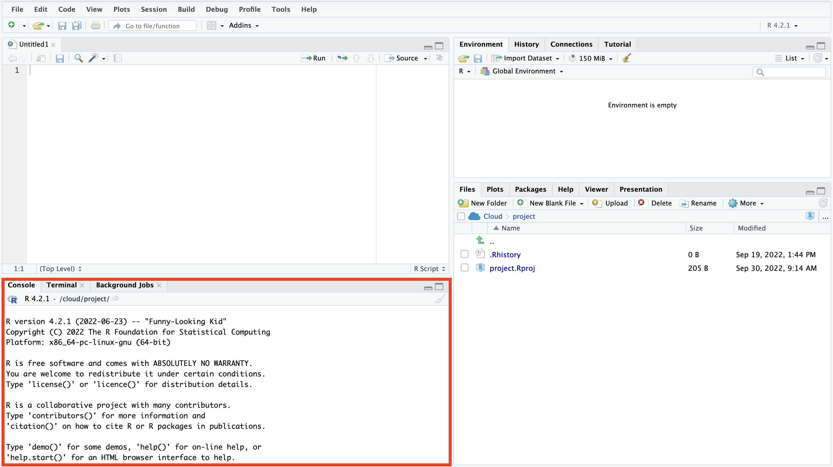
In the bottom left, you will find the console pane.
Source: Maarten Lambrechts, CC BY SA 4.0
In the console you can type in R commands and run them by pressing enter. Any output will also be displayed in the console, just like any errors and warnings resulting from running commands.
Finally, in the bottom right, you will find the pane to manage your files and R packages.
Source: Maarten Lambrechts, CC BY SA 4.0
This is also the place where plots you generate with ggplot2 will be displayed (under the Plots tab). In the Help tab, you can consult the documentation for all R commands and for all commands of any installed R packages.
Making visualisations with ggplot2
The following instructions are valid for RStudio Cloud. The instructions for RStudio are very similar, the only difference being the loading and saving of files.
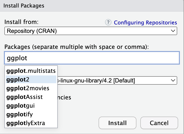
To make visualisations with ggplot2, you need to install the package first. You can do this by clicking on the “Packages” tab in the pane in the bottom right, then click the “Install” button and search for ggplot2 in the dialog that opens.
Source: Maarten Lambrechts, CC BY SA 4.0
Select ggplot2 and click install.
Next, you need to load the freshly installed package into your R session. Do this by typing
library(ggplot2)into a new R script (you can open a new R script with File > New file > R script). Run this command by clicking the “Run” button at the top of the code editor pane.
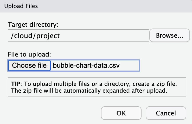
You are almost ready to make plots with ggplot2. The only thing lacking is the data. Download the data file below and save it on your computer.
The Upload Files dialogue of RStudio
Next, click the “Upload” button in the Files tab in the bottom right pane, navigate to the file you just downloaded, and upload it (you don’t need to change the default target directory it will be uploaded to).
Source: Maarten Lambrechts, CC BY SA 4.0
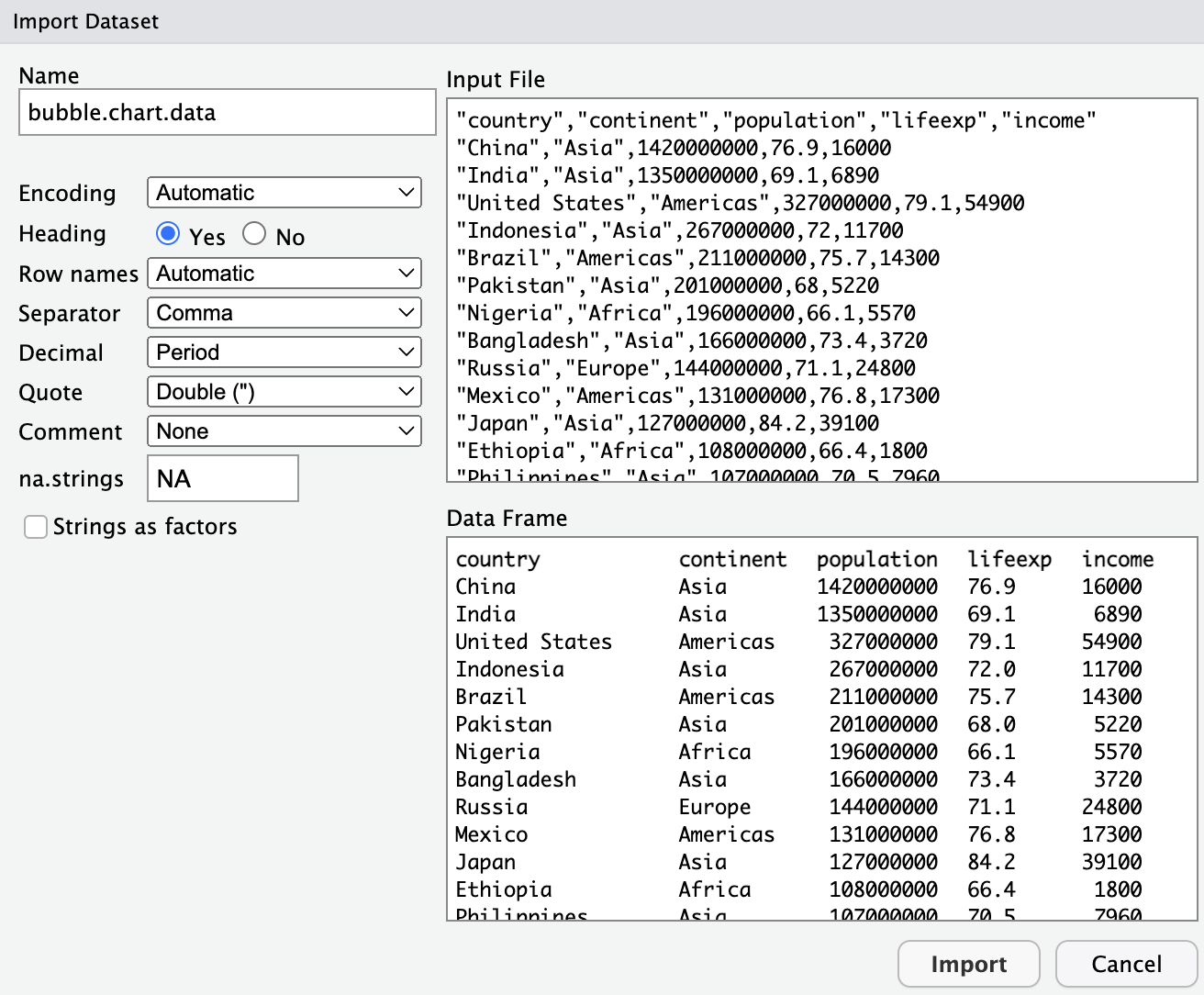
After this, the file will be listed in the Files pane. You can now import it by clicking the “Import Dataset” button in the environment tab. Select “From Text (base)”, select the file you just uploaded and click “Open”.
In the next step, you don’t have to change anything, and you can just click “Import”.
Source: Maarten Lambrechts, CC BY SA 4.0Source: Maarten Lambrechts, CC BY SA 4.0
After this, the data will open in a new tab in the source pane, and the imported data is listed in the environment tab.
Source: Maarten Lambrechts, CC BY SA 4.0
If you navigate to the “History” tab in the pane in the top right, you can see the commands RStudio has run:
library(ggplot2)
bubble.chart.data <- read.csv("/cloud/project/bubble-chart-data.csv")
View(bubble.chart.data)
With the read.csv() command you have loaded the CSV file, and with the View() command you have opened a new tab with a preview of the data table.
In order to make the data loading command part of the R script, select the line with the read.csv() command in your History, and click the “To source” button above it. This will copy the line to your R script.
To make sure to not to lose your work, save the R script with File > Save and give it a name.
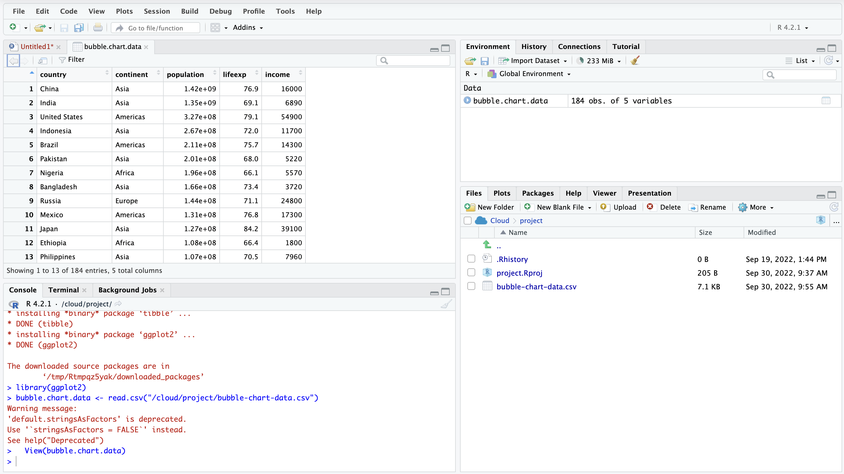
Now you can start building up the visualisation. The main function of the ggplot2 package is the ggplot() function. It accepts a data argument, with the data to be plotted, and a mapping argument to map variables in the data to aesthetics.
ggplot(data = bubble.chart.data, mapping = aes(x = income, y = lifeexp))If you run this command (by setting the cursor on it and click the “Run” button), a first plot will be generated.
Source: Maarten Lambrechts, CC BY SA 4.0
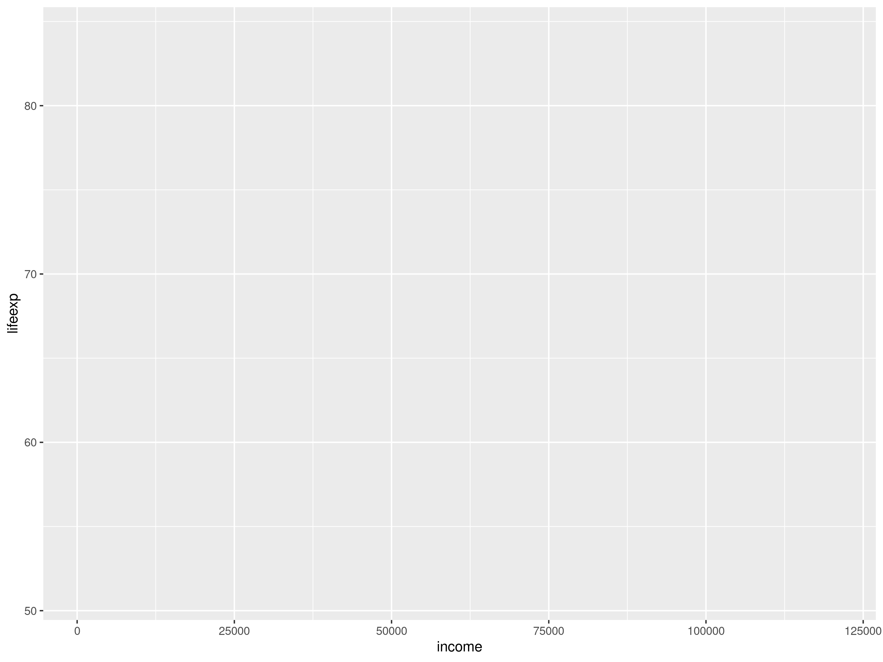
From the axes of this plot you can see that ggplot2 correctly mapped income to the x aesthetic and life expectancy to the y aesthetic. But nothing is drawn yet on the plot. The reason is that the the ggplot code is still missing a specification for what geometries to use in the plot. Let’s add a point geometry to the plot with geom_point()
ggplot(data = bubble.chart.data, mapping = aes(x = income, y = lifeexp)) +
  geom_point()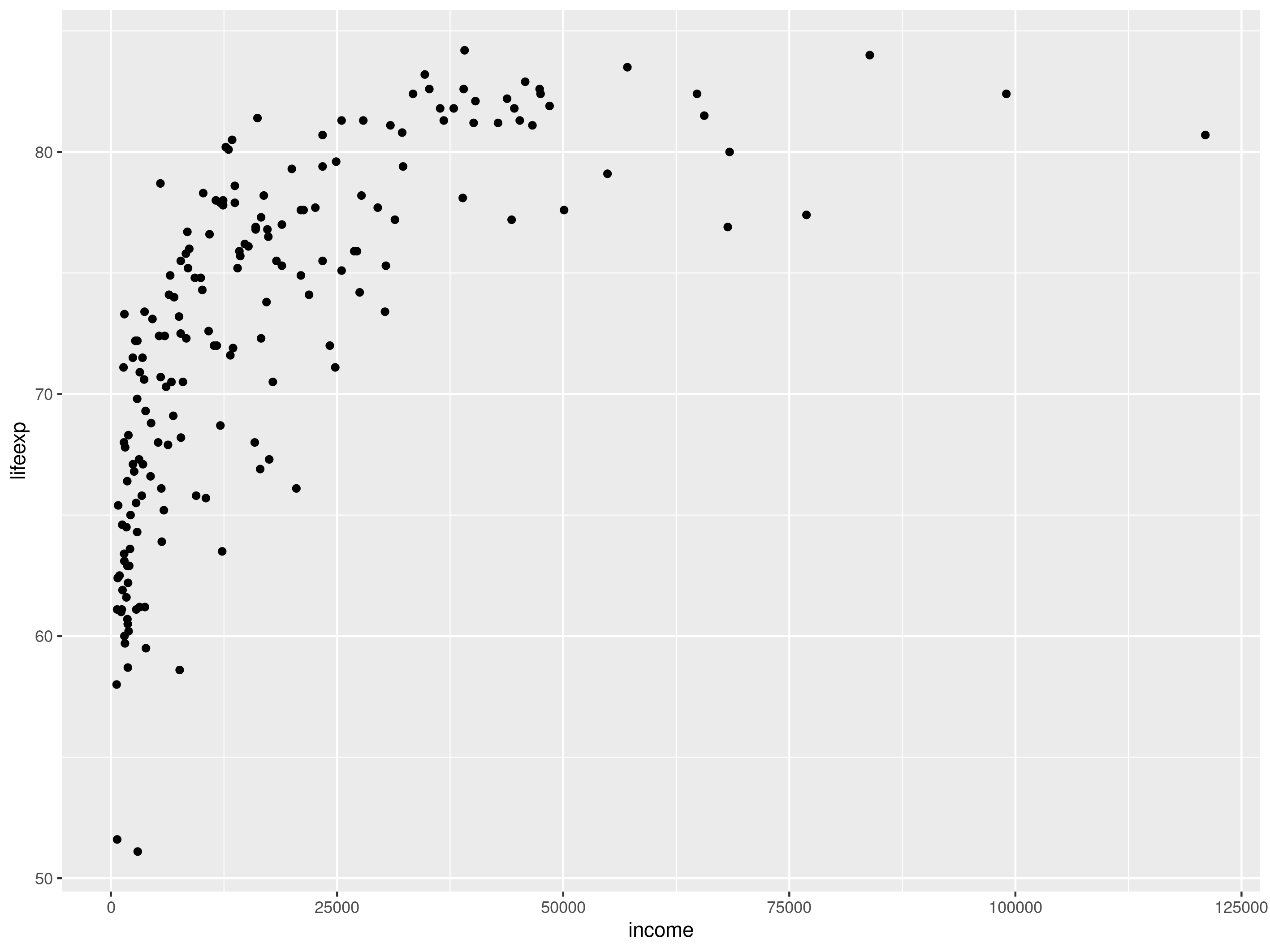
Source: Maarten Lambrechts, CC BY SA 4.0
Next, we can add the other aesthetics:
ggplot(data = bubble.chart.data, mapping = aes(
  x = income,
  y = lifeexp,
  size = population,
  colour = continent)) **+
geom_point()**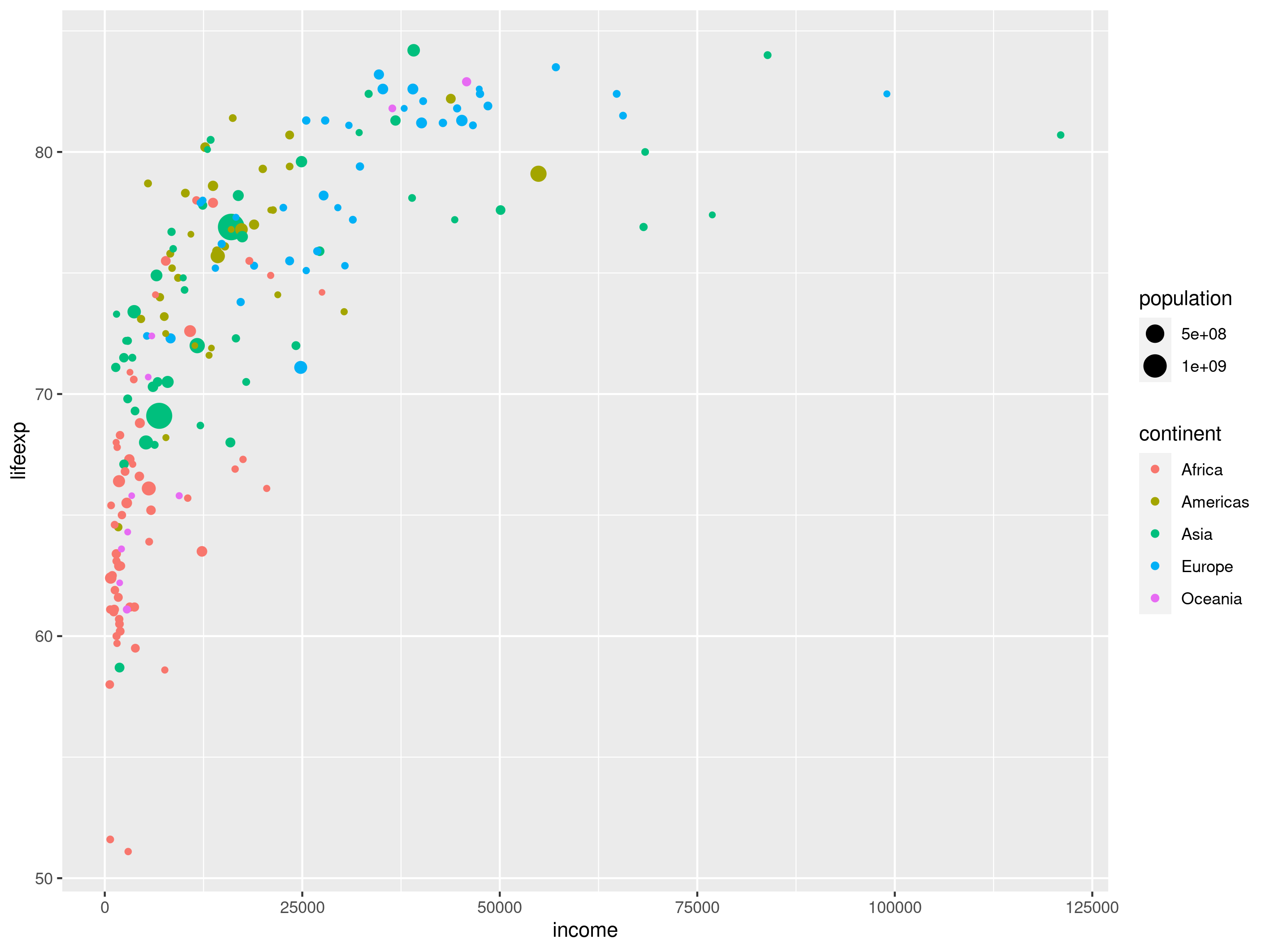
Notice the legends for the population and the continent mappings. Source: Maarten Lambrechts, CC BY SA 4.0
All the aesthetics are in place now, and you can start configuring the scales. In ggplot2 you do this by adding scale() functions to the plot. The name of the scale functions is of the format scale_AESTHETIC_SCALETYPE(). For example, to turn the x scale into a logarithmic one, you add a scale_x_log10() function to the plot:
ggplot(data = bubble.chart.data, mapping = aes(
    x = income,
    y = lifeexp,
    size = population,
    colour = continent)) +
  geom_point() +
  scale_x_log10()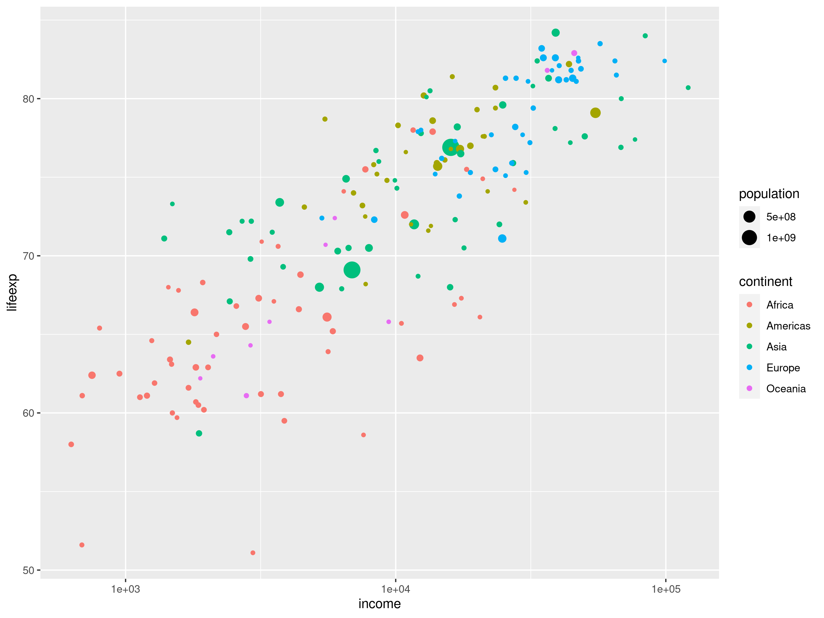
Source: Maarten Lambrechts, CC BY SA 4.0
The size of the bubbles is controlled by a size scale. Because we want the area of the bubbles to represent the population of each country, we can add a scale_size_area() function. Scale functions accept arguments to configure them. You can make the bubble bigger by setting the maximum area with the max_size argument, and you can set the title of the legend for the scale with the name argument.
ggplot(data = bubble.chart.data, mapping = aes(
    x = income,
    y = lifeexp,
    size = population,
    colour = continent)) +
  geom_point() +
  scale_x_log10() +
  scale_size_area(max_size = 32, name = "Population")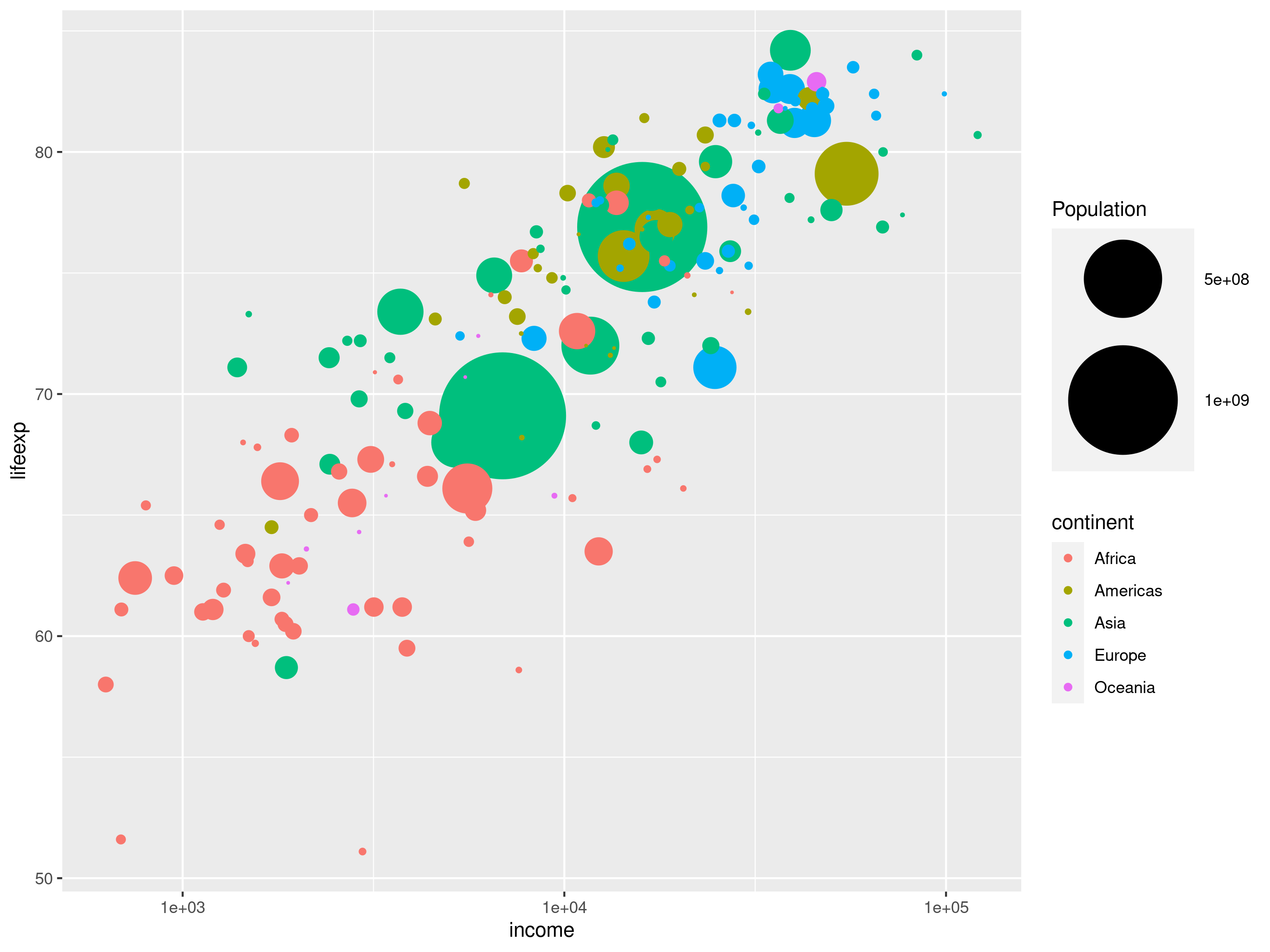
Source: Maarten Lambrechts, CC BY SA 4.0
To make the legend a bit more readable, we can express the population numbers in millions, and add a breaks argument to the size scale to set the values of the legend items.
ggplot(data = bubble.chart.data, mapping = aes(
    x = income,
    y = lifeexp,
    size = population/1000000,
    colour = continent)) +
  geom_point() +
  scale_x_log10() +
  scale_size_area(
    max_size = 32,
    name = "Population (millions)",
    breaks = c(10, 100, 500, 1000))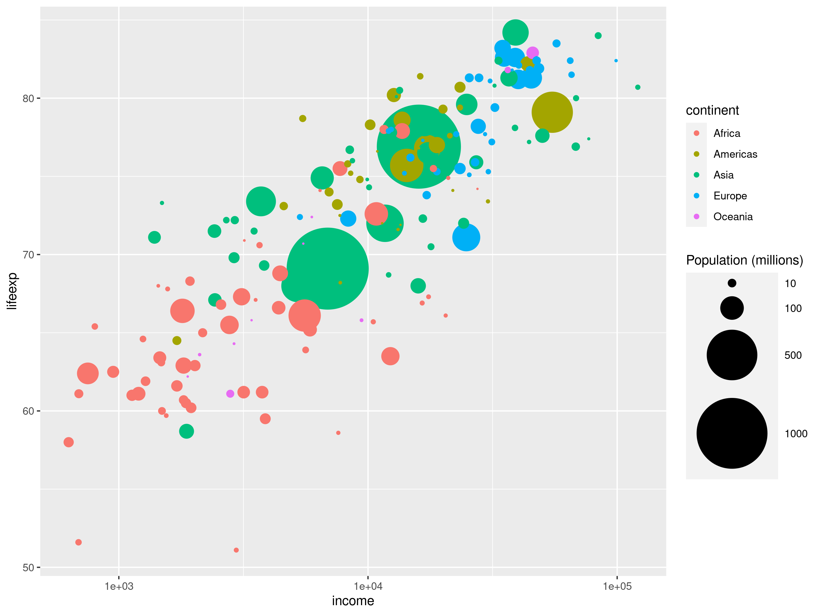
Source: Maarten Lambrechts, CC BY SA 4.0
Now you can start working on the styling of the plot. In the original chart, the bubbles have a black outline. To replicate that, you have to change the mapping of the continent variable: it should be mapped to the fill aesthetic instead of to the colour aesthetic. Not all shapes available in geom_point() have both a colour and fill aesthetic. But shape 21 is a filled circle (all shapes have a number in ggplot2, you can find all the available shapes in the ggplot2 documentation).
ggplot(data = bubble.chart.data, mapping = aes(
    x = income,
    y = lifeexp,
    size = population/1000000,
    fill = continent)) +
  geom_point(shape = 21) +
  scale_x_log10() +
  scale_size_area(
    max_size = 32,
    name = "Population (millions)",
    breaks = c(10, 100, 500, 1000))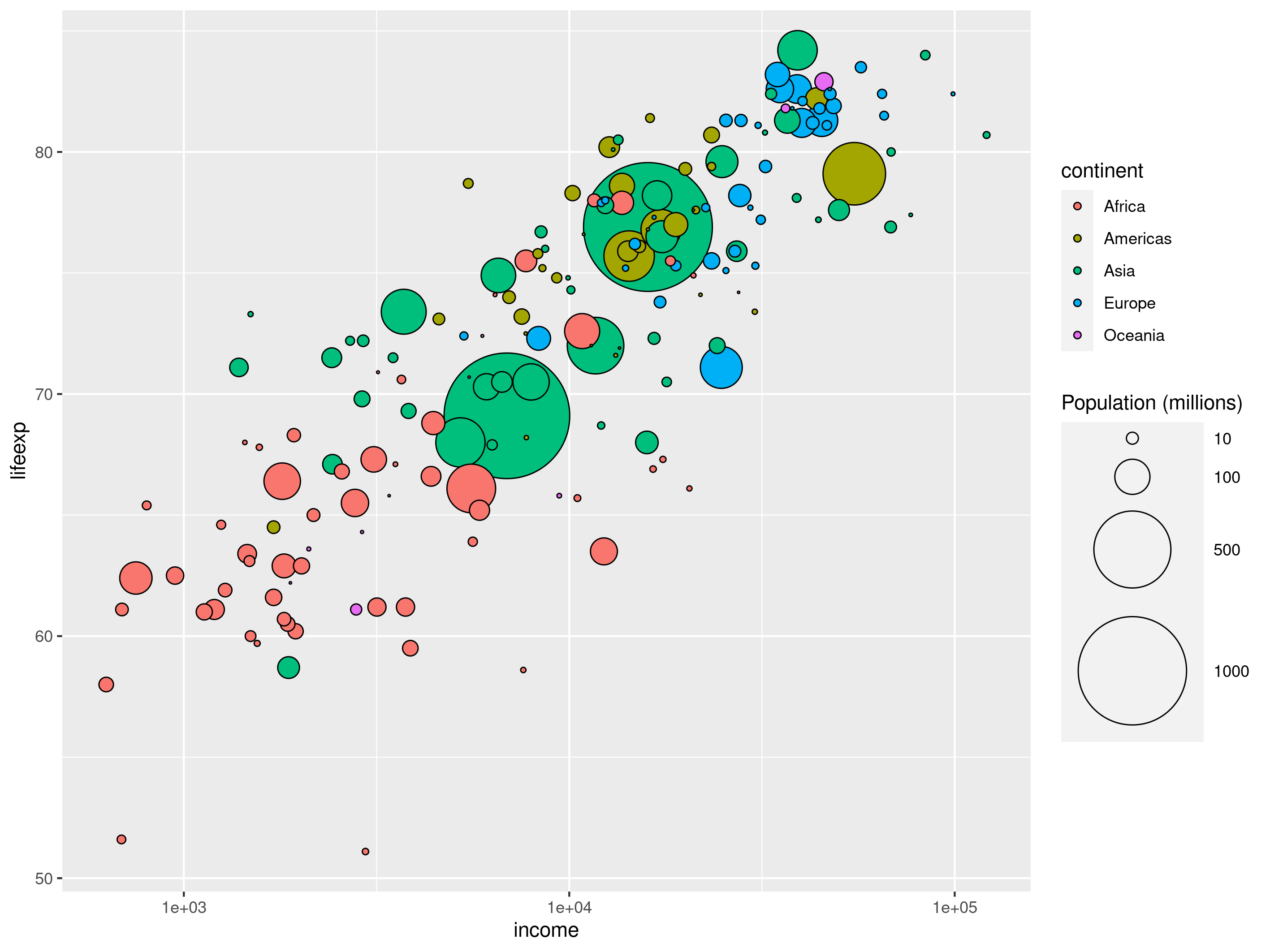
Source: Maarten Lambrechts, CC BY SA 4.0
For now, the plot is still using the default ggplot2 categorical colour palette for the fill of the circles. Let’s change that by adding a scale_fill_manual() scale and apply custom colours with its values argument. You can capitalise the legend title with the name argument.
ggplot(data = bubble.chart.data, mapping = aes(
    x = income,
    y = lifeexp,
    size = population/1000000,
    fill = continent)) +
  geom_point(shape = 21) +
  scale_x_log10() +
  scale_size_area(
    max_size = 32,
    name = "Population (millions)",
    breaks = c(10, 100, 500, 1000)) +
  scale_fill_manual(
    values = c("#FF265C", "#FFE700", "#4ED7E9", "#70ED02", "purple"),
    name = "Continent")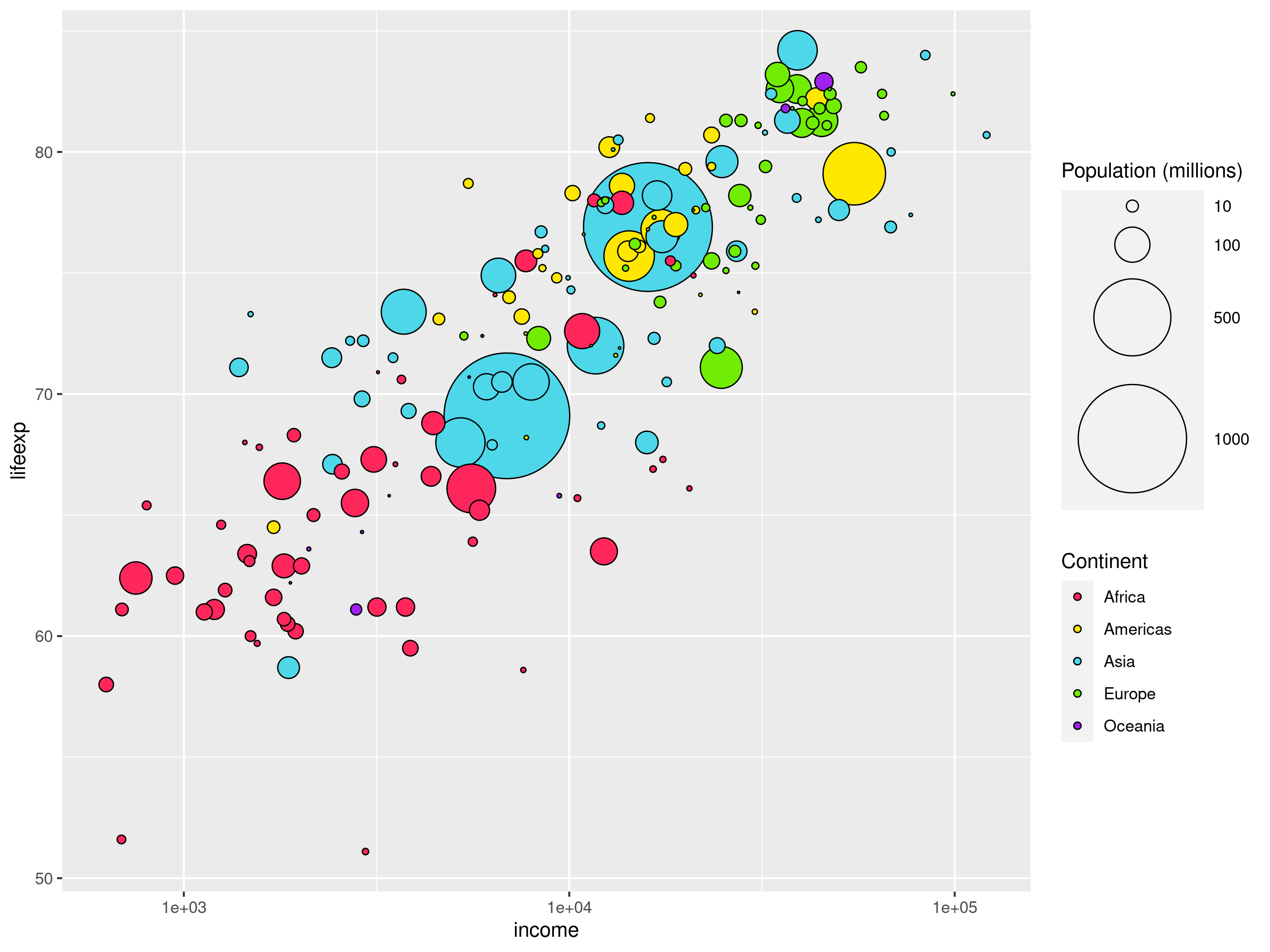
Source: Maarten Lambrechts, CC BY SA 4.0
Now it is time for theming. The plot uses the default ggplot2 theme, with its characteristic grey plot background. A more neutral theme that is built into ggplot2 is theme_minimal() (see a list of available built in ggplot2 themes here).
ggplot(data = bubble.chart.data, mapping = aes(
    x = income,
    y = lifeexp,
    size = population/1000000,
    fill = continent)) +
  geom_point(shape = 21) +
  scale_x_log10() +
  scale_size_area(
    max_size = 32,
    name = "Population (millions)",
    breaks = c(10, 100, 500, 1000)) +
  scale_fill_manual(
    values = c("#FF265C", "#FFE700", "#4ED7E9", "#70ED02", "purple"),
    name = "Continent") +
  theme_minimal()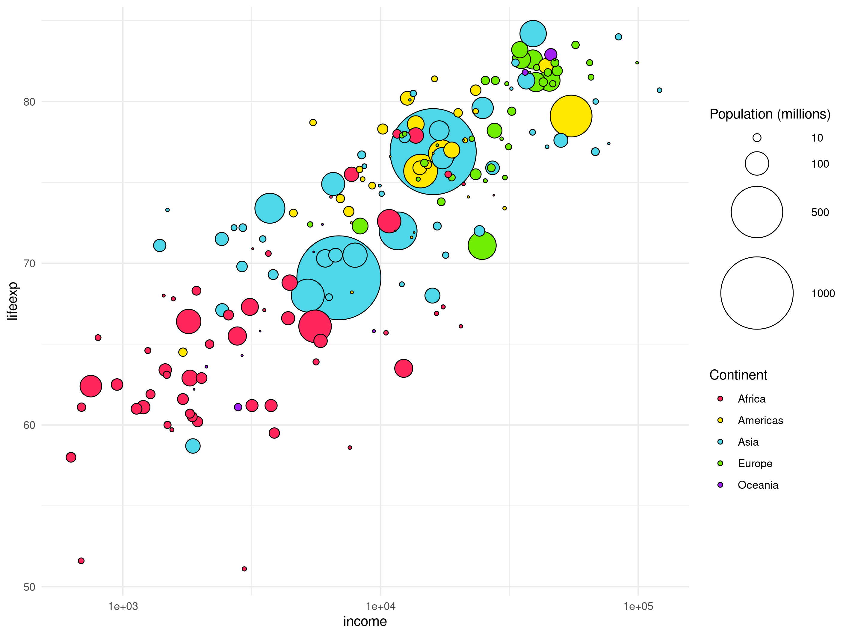
Source: Maarten Lambrechts, CC BY SA 4.0
On top of the theming configuration of theme_minimal(), you can add more theming with the theme() function. With this function you can edit many elements of the plot (see the documentation of the ggplot theming for a complete overview).
As an example, you can move the legend to the top of the plot, and remove the minor grid lines (the grid lines which don’t have an axis label). Removing elements in theme() is done by setting the elements to element_blank().
ggplot(data = bubble.chart.data, mapping = aes(
    x = income,
    y = lifeexp,
    size = population/1000000,
    fill = continent)) +
  geom_point(shape = 21) +
  scale_x_log10() +
  scale_size_area(
    max_size = 32,
    name = "Population (millions)",
    breaks = c(10, 100, 500, 1000)) +
  scale_fill_manual(
    values = c("#FF265C", "#FFE700", "#4ED7E9", "#70ED02", "purple"),
    name = "Continent") +
  theme_minimal() +
  theme(panel.grid.minor = element_blank(),
        legend.position = "top")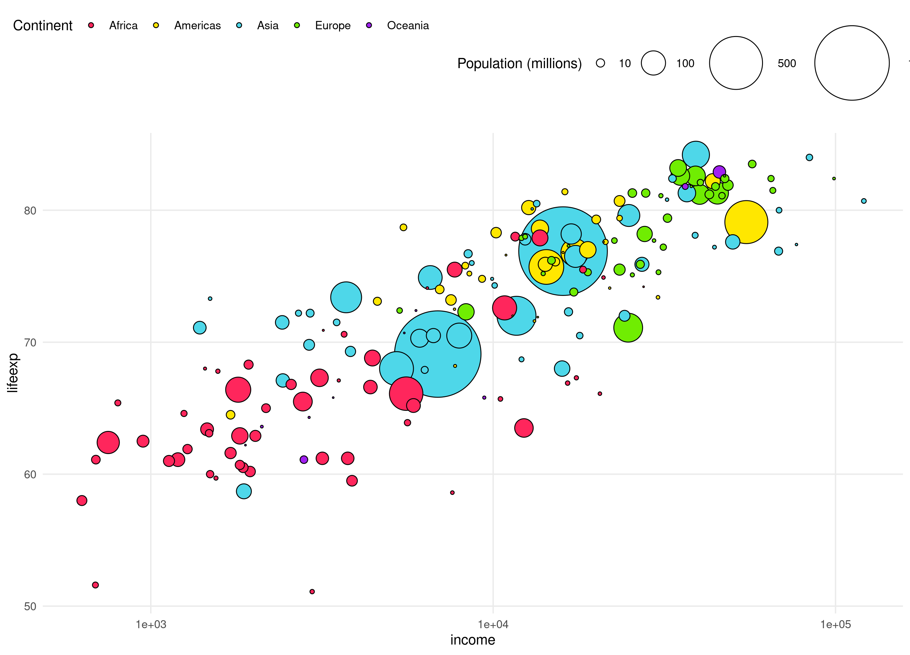
Source: Maarten Lambrechts, CC BY SA 4.0
Finally, you can make the chart more readable by improving the axis titles and adding the units the values are expressed in. Setting the titles of the x and y axis can be done with xlab() and ylab() functions. Let’s also change the number formatting of the x axis labels to be expressed in thousands.
Finally, you can give the plot a title with ggtitle().
ggplot(data = bubble.chart.data, mapping = aes(
    x = income/1000,
    y = lifeexp,
    size = population/1000000,
    fill = continent)) +
  geom_point(shape = 21) +
  scale_x_log10() +
  scale_size_area(
    max_size = 32,
    name = "Population (millions)",
    breaks = c(10, 100, 500, 1000)) +
  scale_fill_manual(
    values = c("#FF265C", "#FFE700", "#4ED7E9", "#70ED02", "purple"),
    name = "Continent") +
  theme_minimal() +
  theme(panel.grid.minor = element_blank(),
        legend.position = "top") +
  xlab("Income (GDP/capita, in thousands of dollars)") +
  ylab("Life expectancy (years)") +
  ggtitle("Strong correlation between economic development and life expectancy")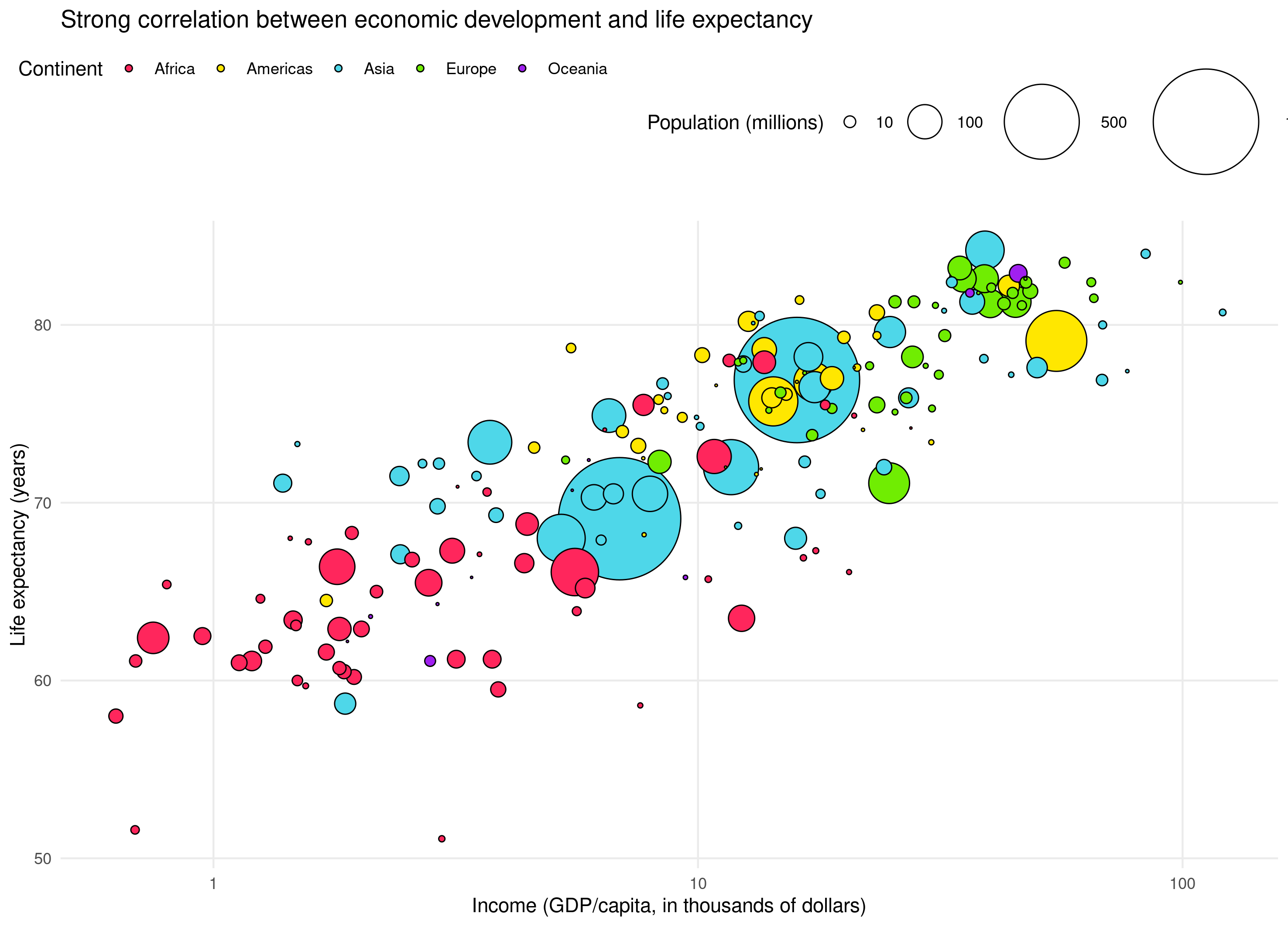
Source: Maarten Lambrechts, CC BY SA 4.0
Now that the plot is ready, you can save it with the ggsave() function. In that function, you need to give the image file a name (the file extension of the filename determines the file format, like .png, .jpg or .pdf) and dimensions by setting the unit argument and the width and height of the image to save.
ggsave(
	filename = "ggplot-bubble-chart.png",
	units = "cm",
	width = 25,
	height = 18)
Extra
Faceting a plot in ggplot2 is done with the facet_wrap() function:
ggplot(data = bubble.chart.data, mapping = aes(
    x = income/1000,
    y = lifeexp,
    size = population/1000000,
    fill = continent)) +
  geom_point(shape = 21) +
  scale_x_log10() +
  scale_size_area(
    max_size = 32,
    name = "Population (millions)",
    breaks = c(10, 100, 500, 1000)) +
  scale_fill_manual(
    values = c("#FF265C", "#FFE700", "#4ED7E9", "#70ED02", "purple"),
    name = "Continent") +
  theme_minimal() +
  theme(panel.grid.minor = element_blank(),
        legend.position = "top") +
  xlab("Income (GDP/capita, in thousands of dollars)") +
  ylab("Life expectancy (years)") +
  ggtitle("Strong correlation between economic development and life expectancy") +
  facet_wrap(~continent)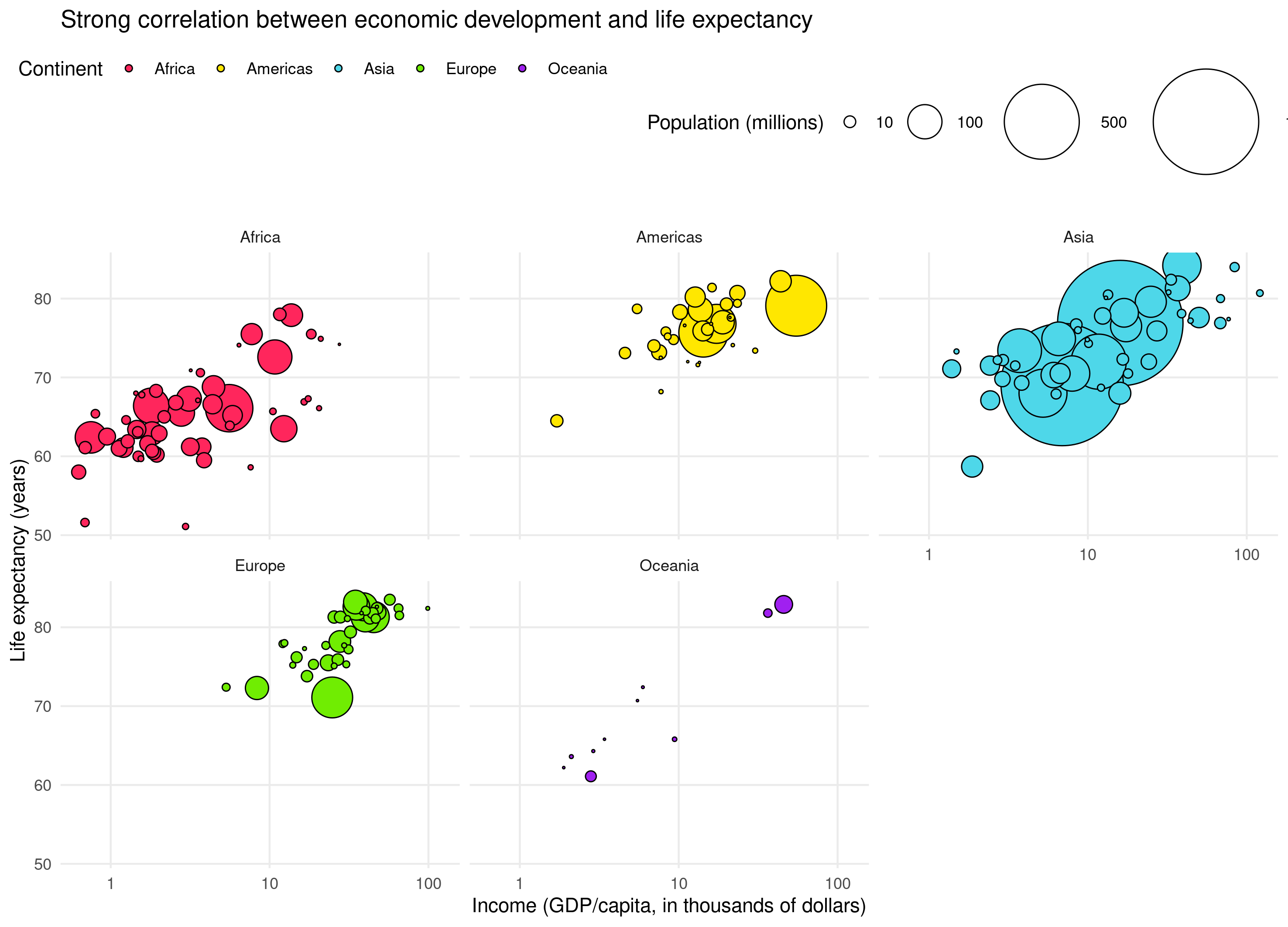
Source: Maarten Lambrechts, CC-BY-SA 4.0
Resources
Below are some links to learn more about ggplot2.
- RStudio Cloud offers some tutorials (called primers) about visualising data with ggplot2: rstudio.cloud/learn/primers/3
- The creator of ggplot2, Hadley Wickham, has written a book about it, which is fully accessible online: ggplot2-book.org
- Andrew Heiss of Georgia State University created a full course with interactive lessons about ggplot2: datavizs21.classes.andrewheiss.com
- Cédric Scherer published a ggplot2 tutorial under the name A ggplot2 tutorial for beautiful plotting in R
- The full ggplot2 documentation can be found at ggplot2.tidyverse.org
- A cheat sheet with all ggplot2 geometries, scales and other functions can be downloaded from rstudio.com/resources/cheatsheets