Consider the following data table:
| country | continent | population | life expectancy | income |
|---|---|---|---|---|
| China | Asia | 1.420.000.000 | 76,9 | 16.000 |
| India | Asia | 1.350.000.000 | 69,1 | 6.890 |
| United States | Americas | 327.000.000 | 79,1 | 54.900 |
| Indonesia | Asia | 267.000.000 | 72 | 11.700 |
| Brazil | Americas | 211.000.000 | 75.7 | 14.300 |
| … |
This data set (which is a tidy data set) can be visualised as follows:
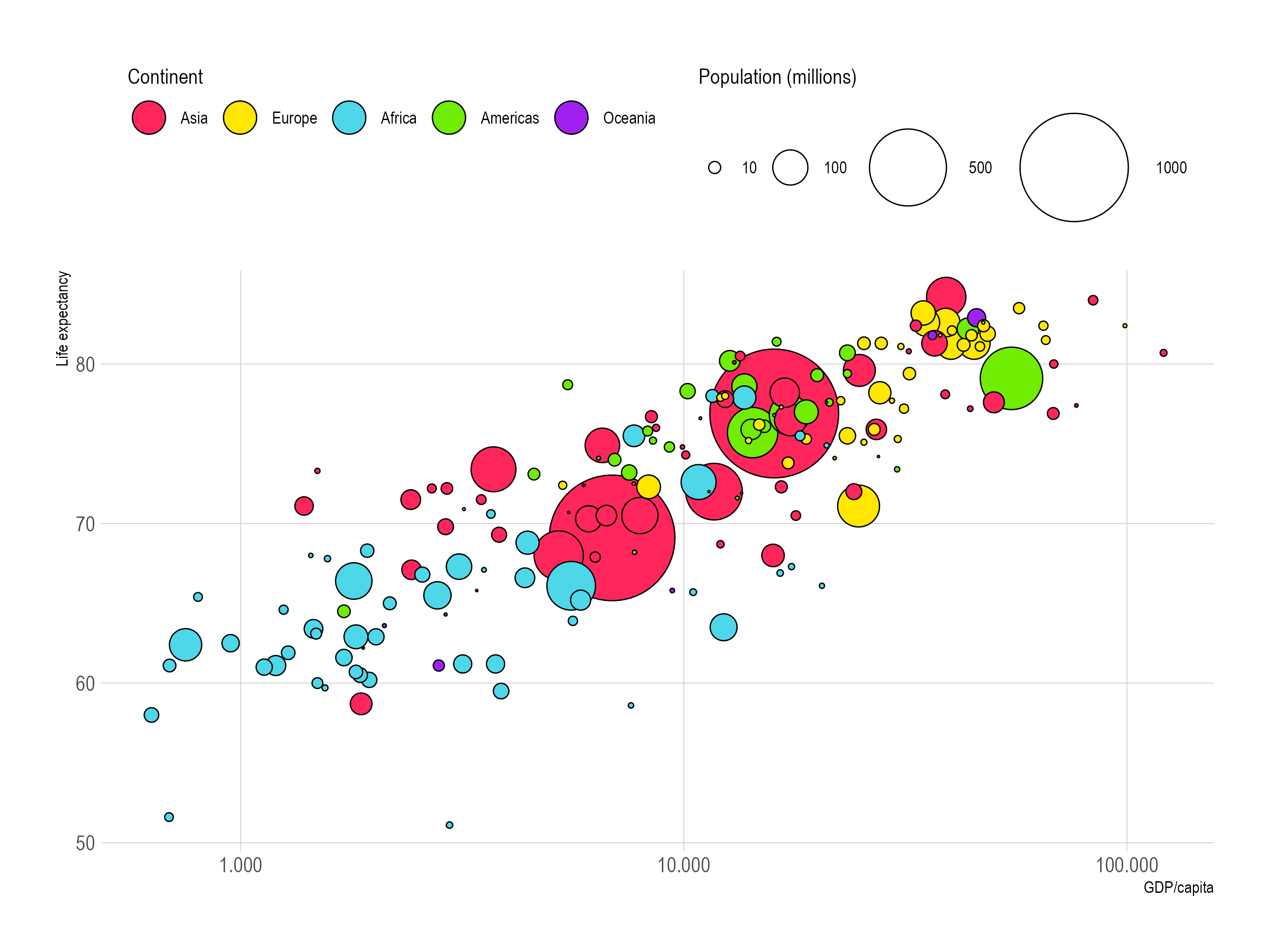
Source: Maarten Lambrechts, CC BY SA 4.0
In chart type vocabulary, this plot is called a bubble chart. But in the Grammar of Graphics, this plot
- uses
pointgeometries - with circle as the
shapeaesthetic - with the
incomevariable mapped to thexaesthetic (in fact, it is the logarithm of the GDP/capita) - with the
life expectancyvariable mapped to theyaesthetic - with the
populationvariable mapped to thesizeaesthetic - and with the
continentvariable mapped to thefillcolour aesthetic
So shape, x, y, size and fill colour are all aesthetics of the point geometry that can be used to map variables in a data set.
In this example, the shape aesthetic is fixed, and no data is mapped to it. The shape aesthetic can be used to map categorical data on the point geometry. In the chart below, the continent variable is mapped to the shape aesthetic instead of to the fill colour aesthetic.

Source: Maarten Lambrechts, CC BY SA 4.0
You’ll notice that processing and understanding this chart is a bit harder than the original one above: it is easier to distinguish between colours than it is to distinguish between the different shapes. So some aesthetics are more powerful than others: fill colour is stronger than shape, for example.
But nothing prevents us from mapping a single variable in the data to multiple aesthetics. In the next plot, the continent variable is mapped to both the shape and the fill colour aesthetics of the point geometry.

Source: Maarten Lambrechts, CC BY SA 4.0
Mapping the same variable to multiple aesthetics is called double encoding: one variable in the data is “encoded” into multiple visual properties of the geometries. Double encoding is especially important when colour aesthetics are used: with double encoding you can ensure that people who cannot fully perceive all colours can still read your visualisation correctly.
“Encoding” is also the term used in Vega-Lite for the process of mapping variables to aesthetics. From the Vega-Lite documentation:
An integral part of the data visualization process is encoding data with visual properties of graphical marks.
In Vega-Lite, geometries are called “marks”, and their visual properties are called “channels”. This terminology is shared by Observable Plot. ggplot2 on the other hand, sticks to the original terminology used in the Grammar of Graphics book by Leland Wilkinson. In ggplot2, data is “mapped” to the “aesthetics” of “geometries”.
| Vega-Lite and Observable Plot | ggplot2 |
|---|---|
| Marks | Geometries |
| Channels | Aesthetics |
| Encoding | Mapping |
Here, we use the terms geometries, aesthetics and mapping.